house: interior feel
I don't have pictures of the inside of our house great enough to do it justice, but people keep asking and something is better than nothing. (You can read all my posts labeled "house" to read this together with other pictures.)
To get your bearings, once again here's the picture of the front of the house from my general post about the remodel.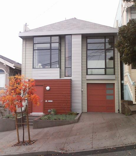
The front window on the right is the office area (here's a close-up of the office). Note how the roof is hipped rather than an upright gable.
From the inside, here's a picture looking from the kitchen past our (messy) kitchen island towards that office window.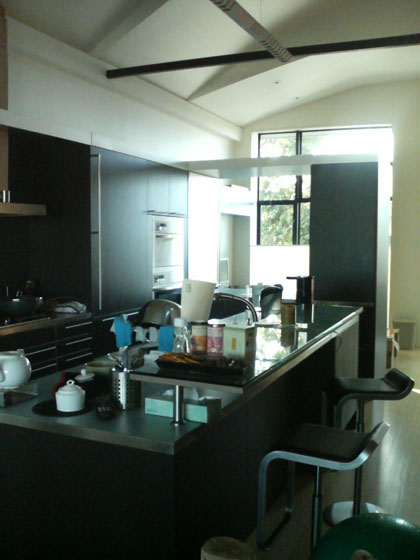 Ignore the bulthaup system 25 kitchen details for now and focus on the space above. Our old house had a double-height living space with a barrel vault ceiling over it, and we told Markoff-Fullerton Architects we liked it. So they and our structural engineer Mike Kaszpurenko of Structural Engineers Collaborative blew up most of the attic, removing all the rafters and beams, and under the roof created a rhythm of folded panels. You can see 2 ½ panels in that picture, the one closest to the window is lower to fit under the hipped roof. There's something about "space above" that is immensely satisfying, this house would be less with just 9-foot ceilings throughout. Initially I wasn't sure about Markoff-Fullerton's relatively complex handling of the ceiling, but without it the second floor would feel like a white barn (not that there's anything wrong with that); this design is substantially richer.
When you remove the roof beams, your house falls down, so that black steel beam in the picture is just part of the elaborate engineering to brace the house. (The silvery thing that seems to meet it is simply a fluorescent light hanging over the kitchen.) The office window has an up-down Hunter-Douglas Duette shade, in the picture its top is lowered to let light in while preserving privacy.
Here's a view the other way, from the office through to the kitchen, with the dining area and then the living room visible beyond.
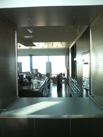
As you can see, this side of the house is a a straight uninterrupted shot from front to back: office-kitchen-dining area-living room, with no interior walls (requiring more structural engineering effort). The second-floor flooring is bamboo ply throughout. As always happens, the absence of walls makes spaces feel smaller than they really are.
The kitchen cabinets form a backwards 'L' shape around the kitchen island, and the part of the 'L' in the foreground forms a "pass-through" from the office to the kitchen. Its sides are two bulthaup appliance hutches with rolltop covers. Steve and Kai from bulthaup-SF at Limn did a great job working with M-F to design the kitchen, they spent two hours just finessing the problem of the corner where the casings meet in the 'L'. As the kitchen grew (the island is 10 feet long!) it shrank the office but it's the literal and figurative center of the house.
My post love handles has a close-up of the black stained oak of the kitchen and its immaculate handles. The gorgeous nordic blue kitchen counter material here and on the island is laminate. We read up extensively on the pros and cons of marble, granite, tile, sandstone, concrete, aggregate, terrazo, stainless, unobtainium, ... and laminate is definitely our favorite and most practical material. (That decision led to major "you can't be serious" attitude from superficial jerks at deluxe kitchen showrooms whose tiny minds can't disentangle wealth from marble counter tops.)
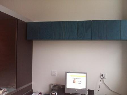
Unfortunately you can't see any of the folded ceiling panels in this picture. After the four variable-height folded ceiling panels over the office and kitchen you can see the ceiling drops down to a flat ceiling over the small dining area, punctuated by exposed bulbs and an access hatch to attic space above it. (All five segments are the same width—Markoff-Fullerton get details right) This is the lowest ceiling on the second floor and makes the dining area feel cozy despite being surrounded by space.
Here's a picture of that dining area.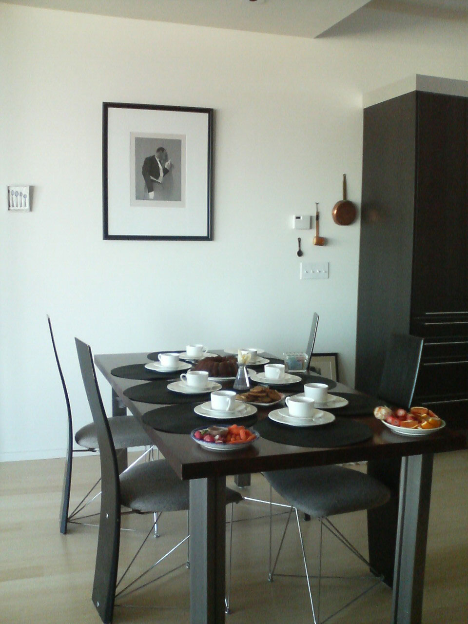
It's a simple orderly space within the progression. The print on the wall is by Mark Stock, the tiny encaustic of the four spoons on the left is by Kelly Luscombe. Since this picture we switched back to a glass tabletop.
I've already shown pictures of the living room in stereo on and great media storage.
This is only one side of the second floor. The other side (bedroom-bathroom-stairs) is different and equally stimulating. It's hard to do the design justice in pictures, and they can't capture the changes as the sun moves and we adjust the shades and lighting.
To get your bearings, once again here's the picture of the front of the house from my general post about the remodel.
The front window on the right is the office area (here's a close-up of the office). Note how the roof is hipped rather than an upright gable.
From the inside, here's a picture looking from the kitchen past our (messy) kitchen island towards that office window.
Ignore the bulthaup system 25 kitchen details for now and focus on the space above. Our old house had a double-height living space with a barrel vault ceiling over it, and we told Markoff-Fullerton Architects we liked it. So they and our structural engineer Mike Kaszpurenko of Structural Engineers Collaborative blew up most of the attic, removing all the rafters and beams, and under the roof created a rhythm of folded panels. You can see 2 ½ panels in that picture, the one closest to the window is lower to fit under the hipped roof. There's something about "space above" that is immensely satisfying, this house would be less with just 9-foot ceilings throughout. Initially I wasn't sure about Markoff-Fullerton's relatively complex handling of the ceiling, but without it the second floor would feel like a white barn (not that there's anything wrong with that); this design is substantially richer.When you remove the roof beams, your house falls down, so that black steel beam in the picture is just part of the elaborate engineering to brace the house. (The silvery thing that seems to meet it is simply a fluorescent light hanging over the kitchen.) The office window has an up-down Hunter-Douglas Duette shade, in the picture its top is lowered to let light in while preserving privacy.
Here's a view the other way, from the office through to the kitchen, with the dining area and then the living room visible beyond.
As you can see, this side of the house is a a straight uninterrupted shot from front to back: office-kitchen-dining area-living room, with no interior walls (requiring more structural engineering effort). The second-floor flooring is bamboo ply throughout. As always happens, the absence of walls makes spaces feel smaller than they really are.
The kitchen cabinets form a backwards 'L' shape around the kitchen island, and the part of the 'L' in the foreground forms a "pass-through" from the office to the kitchen. Its sides are two bulthaup appliance hutches with rolltop covers. Steve and Kai from bulthaup-SF at Limn did a great job working with M-F to design the kitchen, they spent two hours just finessing the problem of the corner where the casings meet in the 'L'. As the kitchen grew (the island is 10 feet long!) it shrank the office but it's the literal and figurative center of the house.
My post love handles has a close-up of the black stained oak of the kitchen and its immaculate handles. The gorgeous nordic blue kitchen counter material here and on the island is laminate. We read up extensively on the pros and cons of marble, granite, tile, sandstone, concrete, aggregate, terrazo, stainless, unobtainium, ... and laminate is definitely our favorite and most practical material. (That decision led to major "you can't be serious" attitude from superficial jerks at deluxe kitchen showrooms whose tiny minds can't disentangle wealth from marble counter tops.)
Unfortunately you can't see any of the folded ceiling panels in this picture. After the four variable-height folded ceiling panels over the office and kitchen you can see the ceiling drops down to a flat ceiling over the small dining area, punctuated by exposed bulbs and an access hatch to attic space above it. (All five segments are the same width—Markoff-Fullerton get details right) This is the lowest ceiling on the second floor and makes the dining area feel cozy despite being surrounded by space.
Here's a picture of that dining area.
It's a simple orderly space within the progression. The print on the wall is by Mark Stock, the tiny encaustic of the four spoons on the left is by Kelly Luscombe. Since this picture we switched back to a glass tabletop.
I've already shown pictures of the living room in stereo on and great media storage.
This is only one side of the second floor. The other side (bedroom-bathroom-stairs) is different and equally stimulating. It's hard to do the design justice in pictures, and they can't capture the changes as the sun moves and we adjust the shades and lighting.
Labels: architecture, design, house
posted by skierpage at
19:13
![]()
![]()


3 Comments:
sorry to leave a note here on your blog but I hope you find it. I was googling some reports on ski's and am just giving up on my 2002 Salomon X scream's and love them an saw you like the ski as well. Have you found anything as good for a replacement? I skied the Fury yesterday and they sucked...so I am a bit lost and looking
e mail me back at ian@pund.com if you have time. cheers.
By The Punoble's, at March 06, 2008 1:53 PM
(People keep posting comments in unrelated articles, it seems Blogger has to improve their UI; I think you meant to post in response to skiing: hick nicks ripped sticks.)
Anyway, I finally bought Völkl AC3 last season, I wrote about it and alternatives in skiing: replacing an icon. Just as I predicted Völkl bumped the numbers up so the same ski is now the AC30. It's better in several areas but still not as good all-round and somehow lacks the “magic” of the XScream Séries.
BTW, if you click the "skiing" label in any of these posts you can follow along in reverse chronlogical order at http://www.skierpage.com/blog/labels/skiing.html
Enjoy, fight global warming!
By skierpage, at March 06, 2008 4:58 PM
Post a Comment
Links to this post:
Create a Link
<< Home