
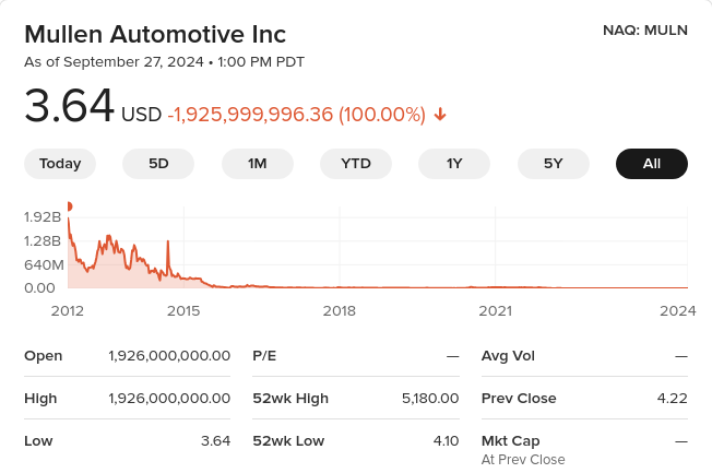
I blogged about EV scam company Mullen Automotive and its bat-sh*t insane stock price shenanigans: a single $MULN share that today costs $3.64 was theoretically worth $1.926 billion dollars 12 years ago! There are other joke companies that are still riding the EV wave in their own toxic cesspool…
Faraday Future fakery
An earlier scam I followed with grim fascination was Faraday Future. Billionaire Chinese entrepreneur Jia Yueting wants to build his own revolutionary EV, so he hires top-notch talent from BMW and Silicon Valley. Except he only has a billion, and it’s not enough due to spage’s law (#4). Furthermore, the company wastes time, resources, and money on a ridiculous FFZERO1 single-seat concept race car and helping out on its Le’Eco car for the Chinese market, a billion-dollar gigafactory in Nevada that never happened. TheVerge had a series of masterful reports on the chicanery. Jia Yueting filed for personal bankruptcy. It did manage to make a prototype of its expensive fast FF91 SUV, but that’s not impressive because as Elon Musk has repeatedly said and tweeted “Prototypes are easy, production is hard” (also “Production with positive cash flow is extremely hard,” his succinct summary of spage’s law #4).
But $FFIE is still going! It merged with a SPAC, a sure sign that its stock was overvalued garbage. It has delivered a handful of the FF91s, but only to company friends and dealers. By not making more than a handful of cars, it can keep going for years, just like Mullen.
Nikola (not-Tesla) Motors, the name alone is suspicious
Next up is Nikola Motors
Utah scammer Trevor Milton (“it’s OK to scam non-believers for the greater glory of the Mormon church) pivoted from cheating his partners on a gas-turbine truck to making a hydrogen fuel cell truck. The chicken-and-egg problem with hydrogen is there are no hydrogen fuel stations, so nobody buys the vehicle, so there’s no demand for hydrogen fuel stations. (Unlike BEVs, which enjoyed an immediate market of millions of people who drive short distances and have an electrical socket in their garage.) Trevor Milton solved this with an audacious plan to build 600 truck stops each producing green hydrogen to refuel the Nikola fuel cell semi truck, and Nikola would include the cost of the truck and the fuel and servicing in a fixed-price lease; “Nikola plans to bill customers for its vehicles a flat rate of $0.95/mile over the life of the 7-year, 700,000 mile lease.” Brilliant, audacious, and requiring both billions of dollars and engineering breakthroughs. Nikola had neither.
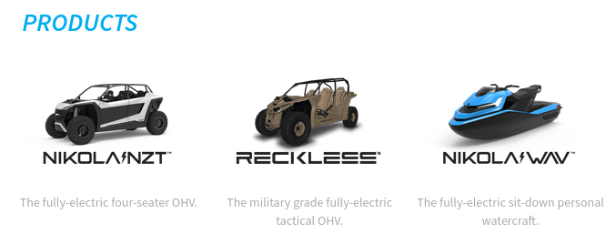
Nikola built a fuel cell truck prototype and Milton claimed “this thing fully functions and works…this is a real truck”, but it quickly pivoted to a bunch of joke renders of hydrogen lifestyle vehicles from its Powersports division: the WAV watercraft, the NZT off-highway adventure vehicle, and the Reckless “military grade fully-electric tactical OHV.” Then it announced a fuel-cell pickup truck and in September 2020 a huge deal with GM where GM would supply hydrogen fuel cell tech, engineer and build the pickup truck, and get $2 billion in newly-issued $NKLA stock (a great deal for GM who had given up on hydrogen fuel cell cars and hoped to sell its fuel cell tech to anyone with a checkbook). But then Hindenburg Research (great name!) wrote the War & Peace of financial investigative reporting, Nikola: How to Parlay An Ocean of Lies Into a Partnership With the Largest Auto OEM in America and revealed an ocean of lies
- the Nikola One prototype wasn’t operational
- the parts in front of the truck were pilfered from the truck
- Nikola claimed proprietary technology but had none. Some of the parts it claimed it built in-house parts were commercial parts with black tape over the manufacturer’s name.
- Nikola’s video of it driving along a road was filmed on the longest straight continuous downhill road in Utah (they even bent a sign to preserve the illusion the road was flat
- Nikola’s VP of hydrogen production was Trevor’s brother who had previously been paving driveways in Hawaii, and its head of building out the 700 hydrogen station network was formerly manager of a golf club.
- Nikola had never made a single kg of hydrogen. It didn’t even have solar panels on its facilities.
- etc., etc.
There is some justice that Trevor Milton was found guilty of fraud and sentenced to four years in prison (he’s still appealing the sentence). But the people who were in on the con took over.
Nikola managed to convert Iveco’s European S-Way truck into the battery-electric Tre, and unlike most of the zombie EV wannabes, it actually did make hundreds of trucks and “sold” them to dealers (who parked them in front of their premises to look green). Alas, four batteries caught fire, so all the trucks were recalled and parked in the desert. It never did build the hydrogen truck stops or make any hydrogen, instead it has a “HYLA” subsidiary which sets up staffed hydrogen refueling locations by simply parking a truck trailer tank full of hydrogen that it ordered from… someone and having an full-time attendant operate the refueling. It has managed to make dozens of the fuel cell version of the Tre, but for those it has to provide hydrogen, so every truck that actually enters service represents huge losses. Unlike Mullen and Canoo Nikola has substantial cash, so it can probably make a hundred or so more trucks before it runs out of money.
Canoo, SOP lies are standard operating practice
Canoo was founded by executives who fled from Faraday Future’s insanity. They had a neat idea for a pill- (suppository?-) shaped EV on a platform that could easily support a commercial van design, a recreational van, a pickup truck. Not terrible, but almost every EV shares this “skateboard chassis” concept.
Promised (SOP) start of production in 2022, then 2023, then… never. And Canoo just announced a reverse stock split.
No cash no cars
These clown EV companies pretend that they can somehow produce cars despite having pathetically little cash, and suckers believe them. At June 30 2024 Canoo (GOEV) only had $4.5M in cash and cash equivalents, Workhorse only $5.3M, and the king[*] of scam reverse stock split hell (a single MULN share has “lost” $2 billion in value!) Mullen Automotive only $3.5M.
But FFIE takes the cake. Its Q2 2024 press release doesn’t mention cash at all, but I found its 10-Q: it went from having $17M in cash in June 2023 to just $793,000!!
Actual car makers like Rivian and Lucid can survive losing $50,000+ on each car they make because they have billion-dollar cash cushions. Now imagine what FFIE would lose making a $300,000 EV in tiny quantities. If it makes three cars it would immediately go bankrupt.
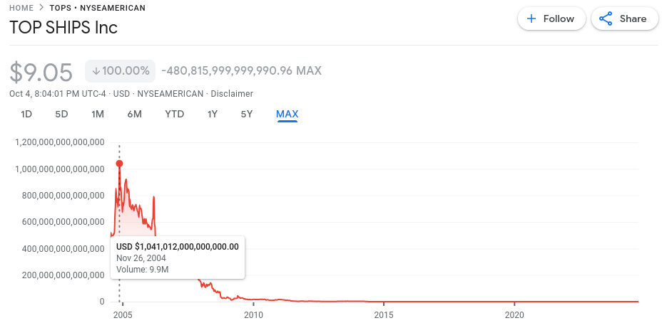
[*] I lied, one share of Top Ships Inc (TOPS) has lost $1.014 trillion dollars from its theoretical peak pre-splits. So FFIE could keep this scam going for years.
spage’s law #4
EV startups can lose $millions a month promising to enter volume production “soon,” or they can actually start cranking out vehicles and immediately lose $100M+ a quarter.
Aptera, Canoo, Einride, ElectraMeccanica, Faraday Future, Mullen (total scammers), Nikola (back to promising HFC production after the battery Tre fiasco), Phoenix Motors, REE, XOS, etc. are all in this zombie state. Lucid and Rivian exited it, but they had $billions in cash. Fisker tried to avoid it by paying Magna to build cars but that didn’t work. RIP Arcimoto, Arrival, Bollinger, Coda (I have a long memory!), Electric Last Mile Solutions, Lightning eMotors, Lightyear, Lordstown Motors, Proterra, Smith Electric, Sono, Volta, Workhorse Group, etc.; all bankrupt or have abandoned electric vehicle manufacturing, and of those I think only Proterra and Smith Electric manufactured hundreds of vehicles.


