Wuff

Wednesday, July 29, 2009

house: bamboo floor, panels, slat

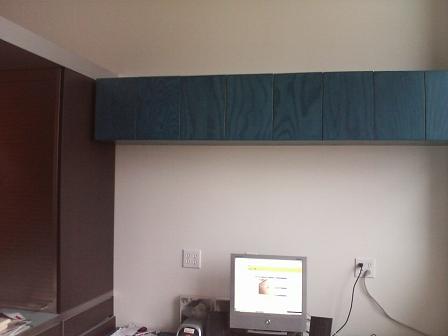
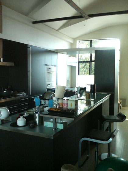
People ask about the bamboo panels on our second floor.kitchen and pantry
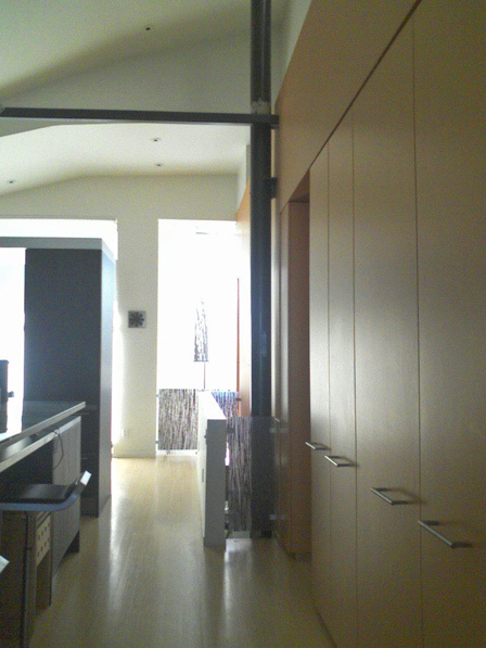
Here's a view of the kitchen and pantry towards the front of the house. The column holds up the roof, the horizontal bar keeps the walls from caving in.

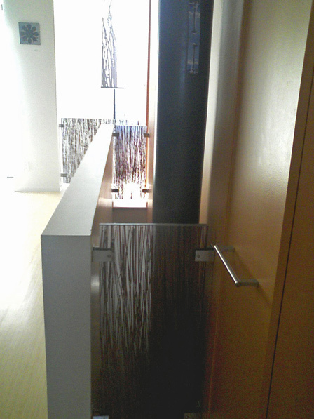
We wanted a connected feel (we've never lived in a place where the floors are divided), so Markoff-Fullerton Architects carved a slot connecting the floors. Also the "nose" at the front of the house is a double-height space. The normal modern architect way to block these gaps off while retaining an airy open feel would be with metal cabling, but the widths are so narrow the mounting hardware would overwhelm the cables. So we had to introduce a new material into the house palette. Fossil Faux Studios had a resin panel with bamboo in it, which echoes the Plyboo flooring throughout the second floor. Saw it into three panels; done.
bamboo panels and the slot

Four-Calendar Café album coverFossil Faux can put anything in resin, like the Cocteau Twins' Four-Calendar Café album cover.

Building code trivia: you're required to have power outlets every 10 feet, so the low wall of the slot has them even though they are ugly and unneeded.

The nose gets a lot of sun, so we bought a hanging fabric slat from Inhabit; you can see it hanging above the three panels. The print is of grass not bamboo, but matches pretty well. What I'd really like is to make the same overlapping pattern in strips of solar photovoltaics, and you could adjust them to either block more light (and thus make more energy) or to let light through in the winter.

I wish Photoshop Elements could do perspective correction as well as simple image straightening!

Labels: ,

Tuesday, June 2, 2009

software: the world is flat but for my house

Google was at Maker Faire promoting SketchUp, a 3D program.

One of the things it can do is texture the surfaces of a model. Wait, Google Maps has a top-down picture of your house from satellite imagery. So draw boundary lines on the edges of your roof, then extrude vertically, then pull up the roof line, and you have a crude wooden-block house shape with your roof. Next, Google Street View may have a drive-by panorama of your house, assuming an angry luddite mob didn't block Google's camera car. So grab the street view and paste it on the front of the model. Five minutes later (assuming you've spent months or years mastering the unintuitive mysteries of a 3-D modeling program) you have a passable representation of your house. You can upload this to Google's 3-D warehouse of SketchUp designs, and you can place it in Google Earth, a more sophisticated version of Google Maps that presents landmarks and other geographic data anywhere and everywhere on earth. When people waltz around your neighborhood in Google Earth, they'll see your dollhouse.[*]
SketchUp house in Google Earth
In the screenshot, the panel below is Google Earth's in-program browser with the house model that Google's 3D ninja whipped up. (Click the screenshot to see more of the Google Earth program).

Yes my neighbors' houses are all low-rise ranch houses sunk into the earth, and there really is a 7-meter shiny ball parked on the street!

Google is crowd-sourcing the creation of a 3-D model of the world. As builders and planners and amateurs create more 3D models, the virtual world gets fleshed out until a fly-through in Google Earth is a pretty good approximation of being there. You can see downtown and the Bay Bridge are getting filled in.
view of downtown SF
It's more evidence for my thesis that computer previsualizations of movies will be good enough to replace the filmed movie.

All of these tools and programs are free, I don't know where Google makes money. Google is looking to get 3D into the browser, so soon you'll get all this in Google Maps; maybe Google will sell billboards in virtual earth. Or maybe they'll charge to have you socialize in it with other avatars.

[*] If you want to see my house, you've got to ask for the additional 3-D warehouse, it doesn't appear automatically. I guess that provides some protection for Google against complaints from house-proud owners that a griefer uploaded a model that makes their property look ugly, or shows a guy mooning out of a window.

An interesting question is why doesn't Google automate this. They have the overhead picture, they have the front picture, so run some AI to glue the two together so my neighbors' houses poke out of the ground to form a 3D canyon.
Road Rash screenshot
I asked Google's modeling ninja and he said the AI isn't smart enough to do it. 10 years ago MetaCreations released Canoma which supposedly let you semi-automatically pin photographs onto 3D shapes and it would guess the outlines of the building. Despite all the wonders our network of computers is producing, hard AI remains hard.

Labels: , , ,

Sunday, April 19, 2009

eco: solar heating means green jobs!

Our solar photovoltaic panels sit there making a dollar or two of electricity every day for us. Zero maintenance, besides occasionally wiping the grime off the panels.

As I intimated, solar heating is another story. After only two years the solar tubes on our roof stopped providing domestic hot water, so we had to turn on the back-up electric strip heater in one of our storage tanks to get hot water. A 50-gallon electric kettle is a very expensive way to get hot water, requiring far more electricity than our solar panels generate.

It was difficult to find anyone willing come and service it. (Our general contractor fired the original designer/subcontractor Bill Reyno and we wound up in legal mediation with the contractor over delays and non-functioning system.) Solar electric is just a bit of mechanical fabrication and some parts wired together; however, solar heating is tubes, wires, pipes, pumps, fittings, solder, valves, expansion tanks, electronic controllers, solenoids, and heat exchangers. There's no standardization, every contractor does it differently, and no one wants to take on responsibility for someone else's design with which they disagree. Everyone who's ever looked at our system has responded "I wouldn't do it that way..."

Finally Luminalt sent some people out. They figured out one of the pumps wasn't working. They had to isolate that pump, drain the system, dismantle it, find a lump of solder inside gumming on the mechanism, refill the system, replace a pressure valve, charge the system with glycol, test everything out. Two and a half guys, two days, $1100. Have no doubt that being environmental means green jobs for Americans! Better yet, the business end seems a little disorganized and they've yet to send me a bill!
158 degrees Temp from Solar!tank at 129 degrees!
Since Luminalt fixed it, we've been getting much hotter water, maybe because they replaced a pressure valve with a higher pressure one.
The rightmost temperature gauge in the first pic shows 158 degree glycol mixture from the solar tubes, and after pumping through a heat exchanger, the top sensor in the second pic shows 129 degree drinkable water in the first tank. It's magic!

On a sunny spring day we're getting more hot water than we need or use, which makes me dream about sending some excess heat to our radiant heating system to heat our house. The system was designed to do that, but that has never worked for a litany of design flaws too depressing to recount. Moving heat around is fiddly and depends on careful system design and installation.
Luminalt installer with Solamax tubes
Three out of the 40 Solamax Direct Flow Evacuated Solar Energy Collector tubes in this picture have condensation on the inside, so they ought to be replaced. I called the distributor SolarThermal, and the guy laughed. If they send these tubes out by UPS, a box of glass shards will arrive on my doorstep. I'd have to pay $300 for a special pallet load to be trucked to my door. That's why most solar installers use flat plate collectors or Mazdon tubes, which are not as efficient but a lot easier to transport.

Labels: , ,

Saturday, August 9, 2008

eco: drying with solar wind power

I showed our first-generation low tech solar wind photonic membrane evaporator, here's its replacement saving money, avoiding pollution, and reducing wear and tear.

clothes drying on laundry trees by Kris Borchardt
Even lower tech than before, but the two laundry tree sculptures by Kris Borchardt are functional art.

And here's lower-tech indoor clothes drying technology for $13.
Pull-out end of retractable clothes dryer lineBusiness end of retractable clothes dryer line

If you put clothes in a dryer during the summer, you're crazy.

Labels: , , ,

Wednesday, March 5, 2008

eco: solar wind photonic membrane evaporator

I wrote about having both kinds of solar panels. (Quick update: The solar heat panels do heat our domestic hot water, but our overall heating system is still a busted inefficient disaster...)

I neglected to mention our third solar system, a proven hybrid technology that takes advantage of wind power as well. Here's a picture of one end of this engineering marvel:
solar photonic wind dryer
Unlike our other solar systems that cost many thousands of dollars, this cost about $25, and a ham-handed DIY disaster was able to install it in an hour. All the parts are available on dusty shelves at Ace Hardware: clothesline cord, two special reels, two hooks, and a nifty line tensioner. And it worked perfectly. Anyone who doesn't install one of these is throwing money away. (Update: Some people don't understand: this is a clothes line so you can dry your clothes for free without running an energy-consuming appliance.)

Despite its excellent technical features, it didn't fit in with our garden landscaping. (We still have a miniaturized version strung across our utility room.) Here's an early look at its replacement:
laundry trees by Kris Borchardt
Two laundry tree sculptures by Kris Borchardt, in the process of installation.

Labels: , , ,

Tuesday, February 26, 2008

house: interior feel

I don't have pictures of the inside of our house great enough to do it justice, but people keep asking and something is better than nothing. (You can read all my posts labeled "house" to read this together with other pictures.)

To get your bearings, once again here's the picture of the front of the house from my general post about the remodel. new house facade
The front window on the right is the office area (here's a close-up of the office). Note how the roof is hipped rather than an upright gable.

From the inside, here's a picture looking from the kitchen past our (messy) kitchen island towards that office window. kitchen looking through to office Ignore the bulthaup system 25 kitchen details for now and focus on the space above. Our old house had a double-height living space with a barrel vault ceiling over it, and we told Markoff-Fullerton Architects we liked it. So they and our structural engineer Mike Kaszpurenko of Structural Engineers Collaborative blew up most of the attic, removing all the rafters and beams, and under the roof created a rhythm of folded panels. You can see 2 ½ panels in that picture, the one closest to the window is lower to fit under the hipped roof. There's something about "space above" that is immensely satisfying, this house would be less with just 9-foot ceilings throughout. Initially I wasn't sure about Markoff-Fullerton's relatively complex handling of the ceiling, but without it the second floor would feel like a white barn (not that there's anything wrong with that); this design is substantially richer.

When you remove the roof beams, your house falls down, so that black steel beam in the picture is just part of the elaborate engineering to brace the house. (The silvery thing that seems to meet it is simply a fluorescent light hanging over the kitchen.) The office window has an up-down Hunter-Douglas Duette shade, in the picture its top is lowered to let light in while preserving privacy.

Here's a view the other way, from the office through to the kitchen, with the dining area and then the living room visible beyond.
looking through kitchen L
As you can see, this side of the house is a a straight uninterrupted shot from front to back: office-kitchen-dining area-living room, with no interior walls (requiring more structural engineering effort). The second-floor flooring is bamboo ply throughout. As always happens, the absence of walls makes spaces feel smaller than they really are.

The kitchen cabinets form a backwards 'L' shape around the kitchen island, and the part of the 'L' in the foreground forms a "pass-through" from the office to the kitchen. Its sides are two bulthaup appliance hutches with rolltop covers. Steve and Kai from bulthaup-SF at Limn did a great job working with M-F to design the kitchen, they spent two hours just finessing the problem of the corner where the casings meet in the 'L'. As the kitchen grew (the island is 10 feet long!) it shrank the office but it's the literal and figurative center of the house.

My post love handles has a close-up of the black stained oak of the kitchen and its immaculate handles. The gorgeous nordic blue kitchen counter material here and on the island is laminate. We read up extensively on the pros and cons of marble, granite, tile, sandstone, concrete, aggregate, terrazo, stainless, unobtainium, ... and laminate is definitely our favorite and most practical material. (That decision led to major "you can't be serious" attitude from superficial jerks at deluxe kitchen showrooms whose tiny minds can't disentangle wealth from marble counter tops.)

Unfortunately you can't see any of the folded ceiling panels in this picture. After the four variable-height folded ceiling panels over the office and kitchen you can see the ceiling drops down to a flat ceiling over the small dining area, punctuated by exposed bulbs and an access hatch to attic space above it. (All five segments are the same width—Markoff-Fullerton get details right) This is the lowest ceiling on the second floor and makes the dining area feel cozy despite being surrounded by space.

Here's a picture of that dining area. little dining area
It's a simple orderly space within the progression. The print on the wall is by Mark Stock, the tiny encaustic of the four spoons on the left is by Kelly Luscombe. Since this picture we switched back to a glass tabletop.

I've already shown pictures of the living room in stereo on and great media storage.

This is only one side of the second floor. The other side (bedroom-bathroom-stairs) is different and equally stimulating. It's hard to do the design justice in pictures, and they can't capture the changes as the sun moves and we adjust the shades and lighting.

Labels: , ,

Saturday, December 8, 2007

house: garden lift-off

reactor core? dilithium crystals?
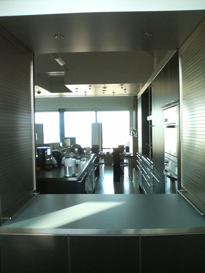
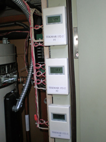
Here are the three reactor cores with the dilithium crystals that regulate the matter-antimatter conversion set to max.


No, it's a water fountain, see the lower-left corner.


Rene, Alma Hecht of Second Nature Design, and Louis of Louis Devereux Landscapes working hard just a few days earlier. (Two weeks ago there was nothing here at all.)

Labels: ,

Monday, January 29, 2007

stereo on

speakers in living roomSound in the new house! Yes, these are large panel speakers; for scale, that's a 70-inch plasma TV between them :-) . I finally bolted them to Mye Sound stands, and the Rega turntable is now on a wall shelf, but otherwise it's my old hi-fi in new location.

It still has a way to go: there's a lot of buzzing from electrical interference, and the sound stage seems hollow in the center (though wide as heck between the speakers). But records that up until now I've only heard on cheap systems are transporting, the detail revealed on Ys is amazing and you hear the sound around the notes that's completely absent in most audio playback. Optimizing the speaker location will take a long time; tweakers on the aptly-named Planar Speaker Asylum say a change of 1 degree or an inch makes a big change in sound. And I may yet spring for the RPG Bicubic Diffusor acoustic panels on the ceiling that Richard Bird of Rives Audio recommended (which cost about 4 times more than the speakers!).

Two friends have the same Magnepan MG 3.6 speakers, and they're also putting time and money into improving the sound. I see the appeal of the easy setup of a big box speaker like the Wilson Audio, but those cost tens of thousands of dollars and the soundstage and treble aren't any better.

Labels: ,

Monday, January 15, 2007

design: great media storage

When furniture designers create storage, they usually create a rigid geometrical grid, of, say 13 inch squares. Then they photograph it with pretentious piles of art books and a handful of CDs tastefully arranged in each square. But that's profoundly stupid. An LP record is 12 inches deep, but a CD is only 5 1/2 inches deep; a DVD is almost the same depth as a CD but taller. So the false logic of the storage grid wastes space.

I've had an inchoate idea for variable-depth media shelves for about 15 years. Architects Markoff-Fullerton brought the vision to reality, and Jesus Esparza of Cabinet Solutions built them. It worked out better than my fondest hopes.

media shelves
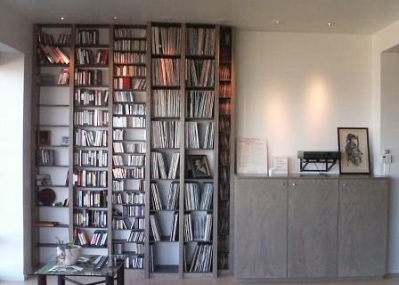
DVDs/videotapes, then CDs/cassettes, then LPs, then 45s. The uprights are closer together than ordinary bookshelves so there aren't wide expanses of LPs to tilt and warp. The three cabinets to the right hold two equipment racks and miscellaneous. The wall bracket holds my beloved incomparable Rega Planar 3 turntable.

Note how the shelves are perfectly evenly spaced from floor to ceiling. Bruce Fullerton is da man. He also met my space budget for each media, though I'm maxed out on singles.

media shelves
This shows the varying depth. It's good for sound quality since it breaks up reflections from the side walls. Note how the supporting shelves are recessed and darker so the uprights, in a lovely stained ash veneer, are more prominent.

I had the idea to take the same design and rotate it 90 degrees for shelves on the other side of the room:bookshelves
(This alcove is where the equipment cabinet was going to go before our acoustic consultant Richard Bird of Rives Audio recommended firing the speakers across the room instead of down the room. There are only a few shelves because there was going to be an elaborate stainless steel mantel continuing from the fireplace that would wrap into the alcove to create a metal container for firewood... too expensive.)

bookshelves
Jesus Esparza of Cabinet Solutions with his masterwork.

Categories: , ,

Labels: , ,

Wednesday, December 13, 2006

house: it's taps for me

Chicago Faucet wrist blade handles
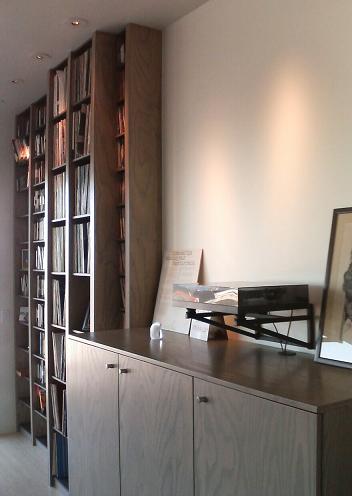
Perfection has been achieved in faucet handle ergonomics: the Chicago Faucet blade-style taps that you see in hospitals and bathrooms for the disabled improved accessibility. But they aren't especially modern.


Dornbracht Tara tapsI knew of Dornbracht , their contemporary classic is the Tara line with cross-shaped handles. But the cross shape looks uncomfortable and is unreadable — you can't tell if the faucet is on or off. They look good even when the taps aren't aligned perfectly, but that benefits plumbers, not owners.


Then I found Dornbracht's Tara Classic, also from Sieger Design but with a single handle. It has some of the ergonomic benefits of a blade handle (you can turn them on and off with your wrists) and a beautiful design. The pulls in the house are satin stainless, but for plumbing we went with chrome because the matching accessories are only available in chrome. Dornbracht has a "platinum matt" finish for handles that is irresistably beautiful even though it doesn't match any other finish in the house. Here they are.
Dornbracht Tara Classic w/ platinum matt handles on Toto Supreme sink
(The sink or "lavatory" as builders call it is a Toto Supreme wall mount with SanaGloss, a glaze that really works to reduce build-up and make cleaning easy. We have a pair of them side-by-side.)

The bathtub has a nest of Tara Classic fittings. (It's a Toto six-foot bathtub, alas not available with SanaGloss.)
Dornbracht Tara Classic w/ platinum matt handles on Toto bathtub

In our downstairs guest bathroom Tara Classic wouldn't work as well because the taps are mounted in a mirror, also that floor has a less refined feel. We chose Kohler Stillness instead. The design is OK but lacks the clarity and tactile pleasure of the Tara Classic. You can tell the look of Stillness came first.Kohler Stillness taps in mirror

Grohe Atria fussy faucet design
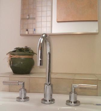
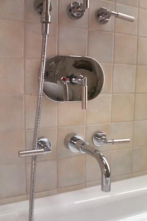
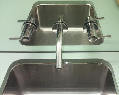
The Tara Classic is such an obvious design, yet nobody else has come close to it aesthetically. This Grohe Atria is similar but way too fussy, its handle pokes out the other side for no good reason. Delta makes a crazy tap unit with similar handles that looks like a V-twin engine. Dornbracht taps cost hundreds of dollars each, yet the Chinese aren't making cheap knockoffs of them, they're making copies of ugly boring designs.


Categories: ,

Labels: ,

house: front façade fixing

new house facade
This was a monstrous remodel to make a modern house.

Here's what it looked like before:
old house facade
Nothing much changed, it's still recognizably a two-story Edwardian with bedroom and office bay windows flanking an odd central "nose", with an entry way and garage below. It's still got wood siding and a hipped (i.e. tilted backwards, unlike a Victorian gable) composite roof. No wonder nobody complained during the permit review. But in fact everything changed:
  • new roof (the old one wasn't strong enough to cope with removing all the rafters and interior walls)
  • rebuilt entry "box"
  • moved garage opening
  • steel framing
  • parapets required for fire code
The house façade had interest, but if you look carefully, it sucked. Nothing lined up:
  • the left bay window hung over the side of the entry box
  • the right bay window was misaligned with the garage
  • the bay windows were different sizes
  • The center front staircase wasn't centered! Furthermore, the pointy stained glass and pointy roof were arrows shouting out "Hey, I'm over a foot off-center to the right"
Some of this is easy to fix, it just rip out and rebuild. But the last was hard, hard, hard to solve. Early in the design we moved the stairs back to the middle of the house, so we had some flexibility. But something had to go between the windows and we wanted to keep light in the front. Our architects Markoff-Fullerton came up with dozens of sketches organizing the four boxes (two windows, entry box, and garage) around the front, they tried extending planes from them like a Peter Eisenman construction, tried making the entry box and nose into a giant 'd' shape. Nothing quite worked. Then they came up with the idea of splitting the nose into partly glass and partly solid. The line between them is perfectly centered.

Unlike a usual McMansion remodel, our architects shrank the front: with the stairs moved to the inside of the house, the nose could shrink, and they pulled the right window back. The solution of the center problem and the stacking of the front four boxes around the nose to form planes of varying depths is a work of complete sustained artistry. Building a modern house from scratch in the middle of nowhere would be far simpler. Yet you'd never know to look at the house how much design effort went into it; our neighbors just like or love the house without really knowing why.

Other notes:
  • The material in the nose and below the windows is Rheinzink, a more environmentally benign material than galvanized zinc.
  • Building codes required lots of ventilation in the garage. Some day we'll swap out one of the vents for another translucent panel and the front will look even better.
  • The entry box was supposed to have a semi-solid golden stain, but it came out darker and then needed a second coat.
  • Elliot Goliger of Artisans Landscape did the front planters.
  • The street tree is a Chinese Pistache (first they made our toys, then our electronics, and now our trees...).
  • I blogged more on the front entry hardware.


,

Labels: ,

house: front detailing

California Contract Co. handrail, Schlage L lock, Obline house numbers, Doorbell Fon, and mail slot
Handles meet up with accessories on the house front.

Note how the house numbers, door handle, doorbell, and generic mail slot are in a perfect line. Bruce Fullerton of Markoff-Fullerton really worked on the horizontal spacing, splaying the numbers across the door in a modestly strong way. I chose the house number font (Obline regular from customhousenumbers.com); unlike most modern fonts the '5' is upright and the '7' has a lovely subtle curve. The California Contract Co. hand rail, house numbers, and Schlage L mortise lock are all in satin stainless steel, but then the Door Fon and the mail slot are in brushed aluminum. If I had the money the finishes would all be identical; I'd also get the ugly gas connection and electrical meters hidden by any means necessary. Mies van der Rohe said "God is in the details", but God had time and money to burn.

, ,

Labels: , ,

house: love handles

With few interior walls and little decorative trim in a modern house, the pulls (what architects and builders call "handles") really stand out.

bulthaup handles
The bulthaup kitchen handles are a given. I don't like the logo they etch on the side, but it would have been crazy to replace them all. (For their new b3 line bulthaup changed the handles, making the supports chunkier.) Note the handles line up nearly perfectly. Dawson+Clinton installed the kitchen.

bulthaup handles
So we used the same handles on the facing 7-foot tall pantry doors from Cabinet Solutions.

Omnia cylinder finger pulls
Here are the pulls on the stained ash living room cabinets. This is my favorite piece of hardware: a cylindrical finger pull with a cylindrical cut-out for your finger. Pure perfection of Platonic form. Everyone makes them. The trick is finishing the edge so they aren't too sharp. I think we used Omnia hardware in brushed stainless steel.

Sugatsune flush pull in cabinet sliding door
For sliding doors in the cabinets, we used Sugatsune recessed pulls. They match the round theme, but somehow don't grab me as much.

office cupboards with touch latches
Sometimes the best handle is none at all. That's the office space where I'm typing this, another great set of stained ash cabinets from Cabinet Solutions with touch latches on the doors. On the left is the black oak "back" of the bulthaup kitchen, which also has touch latches on its drawers. (You can see the desk interferes with one of the drawers, but some day I'll figure out how to make it a height-adjustable sit-stand desk.)

Schlage L handles on Bonelli doors
Here are the door handles on the Bonelli french doors into the garden. The architects specified Schlage L series extra-heavy duty commercial mortise locks. We chose the 02 rounded corner handle in 630 Satin Stainless Steel. They feel great and don't have that extra hook on the handle that would make them look institutional, or the wacky expressiveness of Italian handles. They're expensive compared with Omnia but cheap compared with European locks like FSB.

Sugatsune flush pull and Schlage L lock
We used bigger Sugatsune recessed pulls on sliding doors. The finish almost but not quite matches the Schlage handles (you are in a maze of nickel satin silver, satin stainless, brushed stainless, ...). It would have been perfect if the Sugatsune depression was the exact same size as the collar on the handle; or maybe not, since you grab one and don't touch the other. Beauty, orderliness, utility, simplicity — there's perfection in there somewhere.

California Contract Co. handrail and Schlage L lock
A local fabricator, Michael Stang of California Contract Co., made the handrails for the stairs. They came out really nicely, as they should for thousands of dollars. It would have been so great if the bend radius of the support matched the door handles and the wall plate matched the lock collar!

See also sink handles.

Categories: ,

Labels: ,

Saturday, November 18, 2006

eco: both kinds of solar panels

As I mentioned in comments, the solar power system that's finally working is electricity. Here's a shot of two of the nine photovoltaic panels:
two SX170B 170 W solar panels on roof
Note the shade from neighboring tall house in autumn that's cutting efficiency.

Our heating system is still inoperable, despite 17 months and all those tubes and wires. So the solar heat-collecting tubes have yet to be placed on its rack:
waiting for solar heat tubes
Wait, that entire thing is in shade! Will it ever work?

Categories: , ,

Labels: ,

Tuesday, November 14, 2006

eco: solar power payback time

Jake from Declination Solar installed 9 SX170B 170 Watt panels by BP (the slightly-less-evil oil company that bought Solarex) and a Xantrex grid-tied inverter months ago, but we didn't have sign-off to hook it up and local utility P.G.&E. kept losing our proof of insurance. Finally they found the right form and a guy came out to plug in a new electronic (but not remotely readable) electric meter.

I powered up circuits, turned on the Xantrex inverter, BIOS versions appeared (does this inverter run Linux ?), it began a 240-second countdown to sync up with the utility power, and then:
Xantrex inverter shows 1112 Watts instantaneous, 0.120 kWh so far
Wahoo! 1112 Watts baby!

Run outside to new meter and:
P.G.&E. receiving 451W net from house
I'm contributing more energy than the house consumes, P.G.&E.'s wasteful customers are getting 451 Watts from me. Maybe the polar bears will survive after all.

Of course, if I so much as turn on a hair dryer:
P.G.&E. giving me 1010 W
One 1500 Watt appliance and I've swamped the photovoltaic panels and need 1010 Watts; we're back to paying the utility to burn fossil fuel.

I've yet to get the rebates and tax credit and accounting from our builder, so I'm not sure how much this cost. But it's a great feeling for a drop in the bucket.

Categories: , ,

Labels: ,

Sunday, November 12, 2006

house: beautiful

Random guy on street: "That your house? It's beautiful"

Damn right it is. Thanks to us and Markoff-Fullerton Architects

More to come.

Categories: , ,

Labels: ,

Sunday, July 31, 2005

eco: solar progress uphill

Harnessing solar energy economically is the great engineering challenge of our time. My partner and I are putting solar thermal and photovoltaic on our new house, but we'll spend US$ tens of thousands of dollars (after tax breaks) just to save $100 a month in in electric and heating bills. It's an emotional and spiritual decision, not a rational economic one. But if someone can drive the cost per watt or BTU so low that putting in solar becomes an easy way to Make Money Fast, the market will take over.

Energy Innovations, founded by Idealab dot-com incubator guy Bill Gross, has thought so hard about this, it's inspiring.
  • They're focused on a great mission: "Our immediate goal is to reduce the payback time for a solar system so that it becomes a sensible and logical investment to electricity users around the world."
  • They're focused on a great market: the billions of square feet of roofs of commercial buildings that just lie there, unused, baking in the sun.
  • They're focused on cost over technology. Read their entire Innovations section, especially the "Lessons Learned". They looked at Stirling cycle engines, servo-controlled "petal" mirrors, big heliostat arrays, Fresnel lens concentrators, ... and abandoned them because they couldn't get them cheap enough in a short timeframe.
Yet even with all that focus, it is still so damn hard. Solar cells with reasonable efficiency cost money, so you concentrate sunlight on them with cheap mirrors, but then you have to track the sun with a mechanism that costs money. The more you concentrate, the more you can spend on exotic solar cells, but then you have more mechanical engineering. And the concentrated sunlight bakes the solar cells: you could try to capture that thermal energy but that raises cost and compexity, so you have to come up with a cooling system. The tradeoffs are everywhere.

There are other companies with big ideas: cheap PV films, PV coatings, nano-scale concentrators, etc. While these efforts that could change the fate of the Earth get a few millions in venture funding, the 2005 US energy bill gives around $6 billion dollars in tax breaks to carbon-spewing global-warming smog-creating oil, ethanol, and coal producers.

Categories: , , ,

Labels: , ,