Wuff

Saturday, January 9, 2010

art: Rothko coolly torches SFMOMA

No. 14, 1960 by Mark Rothko in SFMOMA's gallery
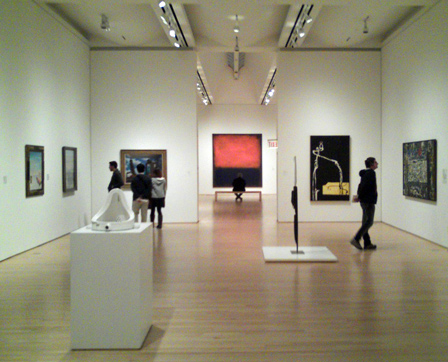
SFMOMA's Rothko (No. 14, 1960) quietly overpowers everything else in the museum. It's not the Titanic, it's the iceberg that sank the Titanic. It's suffused with pure emotion, but it's a receding internal burn. The red is alive but not fiery; the mouth (or dot of the exclamation point?) underneath is a deep inky blue but it's not heavy, you can see through it to the background of quiet earth. The brushwork is sensationally good. Ten feet tall, it's bigger than you but it's taking emotional states available to everyone and exalting them to a mystical, noble level. Duchamp invented so much, Picasso and Matisse were big stars, but in 2200 I'm confident people will rank Rothko higher than any other artist of the 20th century.
No. 14, 1960 by Mark Rothko

Rothko painted a similar design in 1961's Number 207, it's brighter on darker and blacker. The canvas is burning up:
Number 207 by Mark Rothko

Labels:

Saturday, October 17, 2009

art: the lonnnngg view, the evolved sense

A frieze of horses and rhinos near the Chauvet cave’s Megaloceros Gallery, maybe 32,000 years old
Judtih Thurman's New Yorker piece on cave art is inspiring. What were our ancestors thinking 32,000 years ago when they drew animals on the walls by torchlight? Their art affects us so profoundly; does that mean they are close kin to us that we can inhabit in our imaginations, or does art transcend species and culture so we're safer admitting those strangers in the dark are incomprehensible? What does it say about art that five times more than recorded history later, no artist draws animals better?

Meanwhile, Denis Dutton wrote a New Yorker op-ed piece dubious about conceptual art, invented by grand old man Duchamp a mere 90 years ago. He mentions the 32,000 year history of representational drawing, and 100,000 years of decorative shell necklaces, but they're passing fads: he points out our ancestors showed off for 1,200,000 years by crafting attractive Acheulian hand axes. "Ooh, nice symmetrical chipping surfaces, let's mate."

It's interesting, but fails to make a case. So appreciation of skill has been around for 1.4 million years and we've only refined our aesthetic sensibility recently? That is no evidence that we'll regress to a more conservative primitive "if it ain't skilled, it's crap!" form of art appreciation. He says
Jokes about Cadillac tailfins and early fax machines were once amusing, and the same can be said of conceptual works like Piero Manzoni’s 1962 declaration that Earth was his art work, Joseph Kosuth’s 1965 “One and Three Chairs” (a chair, a photo of the chair and a definition of “chair”) or Mr. Hirst’s medicine cabinets. Future generations, no longer engaged by our art “concepts” and unable to divine any special skill or emotional expression in the work, may lose interest in it as a medium for financial speculation and relegate it to the realm of historical curiosity.
But I've never heard of those 1960s pieces —I'm already the future generation—and they sound beguiling and intriguing. One and Three Chairs is excellent! Meanwhile mere skill in the Renaissance religious painting (or in sexy hand axe tip chipping) leaves me lukewarm.
Joseph Kosuth's One and Three Chairs
Back to cave paintings, they've inspired other fine art: Here's William Gibson speaking on the cave paintings as the precursor to movies, and Steely Dan's The Caves of Altamira lyrics.

Labels:

Monday, February 4, 2008

art: Decotora! Decotora! Decotora!

From the “Decotora” photo book. © Masaru Tatsuki

From the “Decotora” photo book. © Masaru Tatsuki

== "Decorated trucks" Makes me homesick for Japan, a place I've only been for 14 days. The obsessive impulse of the "Proud and lonely".

I'd love to see those hurtling over California's I-80 at night through the snow.

Read PingMag's interview with the author of the “Decotora” photo book, Masaru Tatsuki.

Labels: ,

Sunday, January 6, 2008

art: Erik van Lieshout has one approach

On my Minneapolis trip to the Walker Art Center, amongst all the craziness of post-millenium yammering in the Brave New Worlds exhibition, the Homeland Security video by Erik van Lieshout and his cameraman Core was stupid smart.

They visit Jerusalem and Gaza but rather than overtly comment on injustice, struggle, and war they talk about drinking, stomach trouble, and whatever else pops in their heads, while zooming in on female soldiers' boobs and whatever. They're sweaty, bored, confused, rambling. It's Beavis and Butthead do religio-political trouble spots. Yet it makes you see the places freshly. I think their challenge to the viewer is "Could you really do any better? Can you make a difference? Because we know we sure as hell can't!"

Labels: ,

Saturday, January 5, 2008

art: Minneapolis excellopolis

Went to Mpls, real snow in gray landscapes.

Walker Art Center
The Herzog & de Meuron add-on to the Walker Art Center is... OK, in the same way their new de Young in San Francisco is OK. Interesting shapes, modern textures. The off-white plaster with jagged cut-outs inside is just strange, and the logic of two towers escapes me. I didn't know where I was as I walked around.
Herzog & de Meuron robot head
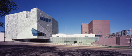
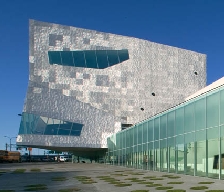
From the right angle the windows cut into the new square tower make it look exactly like a Rock 'Em Sock 'Em Robot. Rarrrr!

The new Guthrie Theater by starchitect Jean Nouvel is anything but just OK. Phallic endless bridge poking out over the Mississipi, theaters way up off the ground, midnight blue color, ultracool pink and dark lounge colors inside. Completely over the top but fun and excellent.

Inside the Walker had YAFF (yet another fine Frida) exhibit, nothing new to see. Elemental, their Minimalist collection, had a nifty piece by Carl Andre, Aisle, just squat oblong logs of rough wood forming a procession. A simple idea made. And a museum guard singing "This is propaganda; you know, you know. This is propaganda", a conceptual piece by some Italian.

They also had Brave New Worlds: "this groundbreaking exhibition offers bold and creative approaches to questions about the artist's responsibility to the world in times of adversity." Blah blah, globalism, videos, installations, multimedia. But the scale of it, 24 artists, drives you to engage with their concerns. SFMOMA's polite presentations of a handful of contemporary artists are seriously weak, dude, by comparison.

Labels: ,

Thursday, December 6, 2007

fashion: Jhane Barnes in person

A store opened up in Walnut Creek in Northern California carrying a treasure trove of Jhane Barnes menswear designs, and Jhane was there in person!

Jhane with the "Infrastructure" shirt I bought, which she signed.

She was gracious and obviously a huge enthusiast of the textile processes and craftspeople that bring her designs to life; she spent a lot of time talking about design and weaving and tailoring with everyone. She wears her artistry lightly, it's running a business with a global supply chain that's a struggle.


That Bartlett Baron store has so many items, it's an art gallery where you can and should touch and examine the artworks, often while worn by other customers ("Mind if I feel your shirt?"). Even with interactive pan and zoom, viewing the clothing on a web site doesn't come close to their physical manifestation. Despite all the on-screen software (PhotoShop and custom pattern software and loom programming) in their creation, they're tailored surfaces with a 3D structure.

I keep saying, her art is so cheap it's a steal, and you can wear it; I should forget about closets and just hang everything on the wall. The gentlemen below own something like 3,000 pieces between them.
Larry Bedini, JhaneBarnes (is God), and John Danielson

Labels: , ,

Thursday, October 25, 2007

art: Open Studios stand-outs

Impermanence Series : Green, oil on canvas, 36 x 48
© tracy taylor grubbs, 2007


Belcher Street Studios artists hit a really high standard:
  • Hadley Northrop, such evocative portraits of warm people in cold climate
  • Tracy Taylor Grubbs' Impermanence paintings of cars gently but inevitably disintegrating into the background are great, Impermanence Blue #2 (no picture available yet, but it's like the one above) is my favorite of the hundreds of works I saw (from only a handful of studios). It's a perfect mix of realism and abstract techniques in a cool take on big hardware in an indeterminate landscape.
  • Carlo Abruzzese, imposing an architect's view onto the landscape
    horizons, 43” x 43”, 2007
    © Carlo Abbruzzese, 2007

Also Emily Clawson and Jhina Alvarado working in encaustic, to reveal landscapes of indeterminate scale. The luminous depth from the layers of wax isn't apparent in pictures, it creates an involving personal object from a 2-D representation of the artist's concerns.
10.03.06, 12” x 12” mixed media encaustic on panel
© Emily Clawson, 2007 

“Fail the Fallen”, 12” x 12”, 2007 encaustic, graphite, and oil on panel
© Jhina Alvarado, 2007


Hmm, "landscape" and climate reoccurs in all these, implicit ecology.

Labels:

art: just get some, you know you need it

San Francisco Open Studios is on. Lots of art, and following Sturgeon's Law, 10% of it is pretty good.

Walking the dogs, I'm stunned by how many bare interior walls I see. Not even a KISS poster, let alone fine art. Heck, get some black tape and frame part of the whiteness, make your own Robert Ryman minimalist monochrome. Then go see some studios the next two weekends! Don't be intimidated, art is just stuff.

Maybe people fear buyer's remorse, getting something that later looks dull, or whose familiarity breeds contempt. Here's my solution! If something strikes a chord, tell the artist, and ask her if you can get an inkjet printout of it for a test drive. Offer $10 for the print, don't be a cheapskate. Take it home and stick it on that bare white expanse that's begging for aesthetic relief. You'll know if you picked a winner. Then go back and buy the original! If you really can't afford art, tell the artist and make a deal. They're poor too.

Labels:

Sunday, August 19, 2007

art: Marcel Duchamp even more significant

While at MOMA for Serra, I went through the collection galleries. Picasso was quite the lad. I didn't realize how his periods overlapped, for example in 1921 he made both the cubist Three Musicians and the chunky Three Women at the Spring. Overall, I think SFMOMA lays out its collection better.

I knew Marcel Duchamp blazed new trails with his readymades, like the "R. Mutt" urinal and the Bicycle Wheel (1913), a bicycle fork and wheel mounted to a chair (MOMA has a remake). The latter is also arguably the first kinetic sculpture.

But he's so much more 3 Standard Stoppages (1913-1914) is pure conceptual art. "A straight horizontal thread one meter long falls from a height of one meter onto a horizontal plane twisting as it pleases and creates a new image of the unit of length." Prefigures everything Sol LeWitt (recently died, RIP) and others have ever done.

Network of Stoppages (1914) with its grid and letters and overpainting seems to prefigure everything that Jasper Johns, Ed Ruscha, and John Baldessari have done.

And the joking around with names like Rrose Sélavy is amazingly prescient.

Nude Descending a Staircase, No. 2 (1912) is a darn nice cubist/futurist work, though he painted it about the same time as those movements.

Incredible.

Labels:

Monday, August 13, 2007

fashion: Jhane Barnes being Jhane

Another season, another stupendous collection. Jhane Barnes is the Barry Bonds of fashion, without the walks or pop-ups or the steroid abuse. Literally thousands of hits and hundreds of home runs. Trajectory is perfect, and Interlock (a triple-woven shirt!) are particularly stellar. The geometric abstraction remains (as I wrote, she's better than Vasarely and up there with Mondrian) but she's doing amazing things with the weaving itself that you can't appreciate on a computer screen. Insanely, few stores in my area carry them.

Jhane Barnes Trajectory shirt
closeup of Trajectory shirtSo many great designs, so little closet space. I'm going to try to get Trajectory (sold out in my size :-( ). Looks nice from a distance but zoom closer and it reveals worlds.

Labels: , ,

Monday, August 6, 2007

art: Serra sublime fun-house

Had to go, so I went. It was much as I expected, that is to say fantastic. Wandering around and inside Richard Serra's latest curved steel sculptures, Band and Sequence, was childlike joy, wonderful wonderment. And wondering: Is there an algorithm to the curves? As the walls lean in and out there must be a vertical spot, why can't I find it? Have I returned to the start? How can the expression of simple ideas create so much beauty?

As I said, Peter Schjeldahl in the New Yorker describes it better than I can (also Jerry Salz in New York magazine). However, what made me literally weak in the knees was Serra's restraint. Coming from such an utterly uncompromising, arrogant, art-star dickhead, these late works aren't what you expect:
  • The steel isn't a harsh hulking black, but a soft clay-like rust color.
  • They're huuuuge, but not oppressive: double-height steel walls cocoon you within the vast museum room.
  • You're pleasingly disoriented, but never lost and abandoned.
  • The shifting points and angles and triangles that the walls form as you move around are intense beyond words, but unlike his earlier works like Circuit II where you feel one control switch away from being crushed, they don't menace.
I can't imagine Serra copping to being a softie, but he could have gone for shock and awe, and didn't. To have so much intent and effort and mass and steel and fabrication directed to deliver bracing aesthetic pleasure makes you giddy with delight; to be an adult and aware of that gentle restraint making "all this useless beauty" in a world of difficulties is somehow sad. I didn't want to leave.

I skipped the catalog and the postcards. The photographs are black and white, but again the late works are a soft orange rust, not hulking black. The photographs are from above, but Serra has said he's not making architecture and he doesn't want you to see a diagrammatic plan view. He doesn't want you to "read" the form of the work from pictures, you have to walk around and inside them. The exhibition closes September 10th. If you can get to New York, go!

Labels:

Saturday, July 7, 2007

art: upcoming religious pilgrimage to Serra

Richard Serra at MOMA, can't say no. I saw experienced his work at Dia:Beacon, first a room with a boat-like presence packed into it, and then the former train dock with three giant torus shapes. It's just you in a room with some heavy-duty steel plate, but it's intense, primal, serious joy."Union of the Torus and Sphere" Richard Serra sculpture, picture by diana saragosa
©2005 diana saragosa, used without permission (I tried to contact her!)

That boat hull (Union of the Torus and Sphere, article) was the most intense marriage of art-in-space I've had the fortune to feel, along with Damien Hirst's dual sectioned cows in vitrines spread diagonally across a room (Some Comfort Gained from the Acceptance of the Inherent Lies in Everything) at the Sensation show. (And any encounter with a Rothko, gazing into a canvas the size of a man, suffused with pure emotion.)

I already know what it'll be like. Peter Schjeldahl in the New Yorker describes what I will feel better than I can.
At the same time, the work is poignant with reminiscences of the two centuries past. As an affair of big, rusty things without practical use, it evokes derelict ships, locomotives, and heavy-industrial factories. It also recalls times when miracles of human invention were still spectacular, like the Brooklyn Bridge, rather than spectral, like the Internet. More generally, Serra conserves a battered modernist confidence in the collective genius of experts, a priestly class that confers meaning and direction on society. Hardheaded secular culture can make no greater claim to spiritual efficacy than it does in this show, appropriately housed in the high church of the twentieth century that is MOMA. The measure is the childlike feeling which the work rewards, a sense that the world’s order and progress are being seen to by sensationally competent adults.

Labels:

Monday, December 5, 2005

art: JhaneBarnes on fire

Jhane Barnes's new shirt collection is her strongest in years, which is really saying something because she is and has been a stone genius in the field of textile design for over 20 years.

Her site now has a video of the design and manufacture of the Infinity shirt fabric. But they're nearly all sensational. You have no idea how great, say, Chute or Clip Out is until you zoom in to the max and see the detail. Next - Zoom - Next - Zoom through the wonders.

Her œuvre raises issues about art and æsthetics that I don't have the intellectual horsepower to address. These things aren't unique; she apparently doesn't suffer for her art; she makes several collections a year of them; there's no overarching sociopolitical statement behind them beyond a deep appreciation of natural forms. While running a business and designing other stuff (fine menswear, furniture, carpets, etc.), she tinkers with custom pattern software and state-of-the-art textile techniques to crank out dozens of designs that you can wear for only $135 - $250. Does that make them mere craft, or design, or commerce, when each is so beautiful in itself and perfectly suited to the scale and shape of the human torso?

Or another way to look at it is, for only $9000 you could own a collection of 45 geometric abstract artworks that are better than anything I've seen in the genre (e.g. here and here) by a living "fine" artist. It's Piet Mondrian and Jhane Barnes and 18th century Kyo-Yuzen kimono designers, then everyone else.

Categories: , , ,

Labels: , ,