house: bamboo floor, panels, slat
People ask about the bamboo panels on our second floor.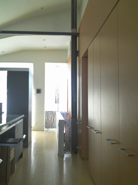 Here's a view of the kitchen and pantry towards the front of the house. The column holds up the roof, the horizontal bar keeps the walls from caving in.
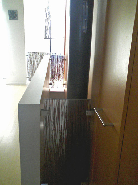
We wanted a connected feel (we've never lived in a place where the floors are divided), so Markoff-Fullerton Architects carved a slot connecting the floors. Also the "nose" at the front of the house is a double-height space. The normal modern architect way to block these gaps off while retaining an airy open feel would be with metal cabling, but the widths are so narrow the mounting hardware would overwhelm the cables. So we had to introduce a new material into the house palette. Fossil Faux Studios had a resin panel with bamboo in it, which echoes the Plyboo flooring throughout the second floor. Saw it into three panels; done.
 Fossil Faux can put anything in resin, like the Cocteau Twins' Four-Calendar Café album cover.
Building code trivia: you're required to have power outlets every 10 feet, so the low wall of the slot has them even though they are ugly and unneeded.
The nose gets a lot of sun, so we bought a hanging fabric slat from Inhabit; you can see it hanging above the three panels. The print is of grass not bamboo, but matches pretty well. What I'd really like is to make the same overlapping pattern in strips of solar photovoltaics, and you could adjust them to either block more light (and thus make more energy) or to let light through in the winter.
I wish Photoshop Elements could do perspective correction as well as simple image straightening!
Here's a view of the kitchen and pantry towards the front of the house. The column holds up the roof, the horizontal bar keeps the walls from caving in.We wanted a connected feel (we've never lived in a place where the floors are divided), so Markoff-Fullerton Architects carved a slot connecting the floors. Also the "nose" at the front of the house is a double-height space. The normal modern architect way to block these gaps off while retaining an airy open feel would be with metal cabling, but the widths are so narrow the mounting hardware would overwhelm the cables. So we had to introduce a new material into the house palette. Fossil Faux Studios had a resin panel with bamboo in it, which echoes the Plyboo flooring throughout the second floor. Saw it into three panels; done.
Fossil Faux can put anything in resin, like the Cocteau Twins' Four-Calendar Café album cover.Building code trivia: you're required to have power outlets every 10 feet, so the low wall of the slot has them even though they are ugly and unneeded.
The nose gets a lot of sun, so we bought a hanging fabric slat from Inhabit; you can see it hanging above the three panels. The print is of grass not bamboo, but matches pretty well. What I'd really like is to make the same overlapping pattern in strips of solar photovoltaics, and you could adjust them to either block more light (and thus make more energy) or to let light through in the winter.
I wish Photoshop Elements could do perspective correction as well as simple image straightening!
Labels: architecture, house
posted by skierpage at
16:13
|
3 comments
links to this post
![]()
![]()
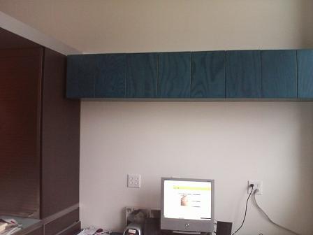
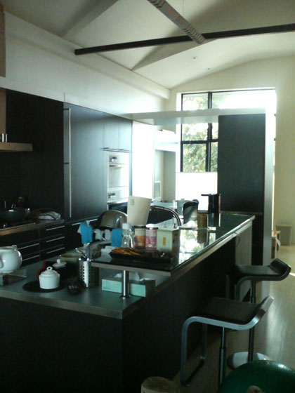 Ignore the bulthaup system 25 kitchen details for now and focus on the space above. Our old house had a double-height living space with a barrel vault ceiling over it, and we told

