house: front façade fixing
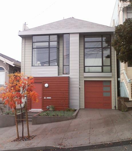
This was a monstrous remodel to make a modern house.
Here's what it looked like before:
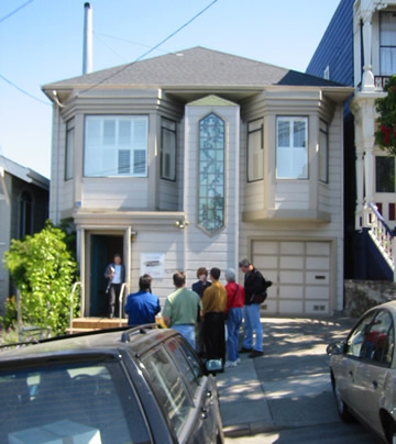
Nothing much changed, it's still recognizably a two-story Edwardian with bedroom and office bay windows flanking an odd central "nose", with an entry way and garage below. It's still got wood siding and a hipped (i.e. tilted backwards, unlike a Victorian gable) composite roof. No wonder nobody complained during the permit review. But in fact everything changed:
- new roof (the old one wasn't strong enough to cope with removing all the rafters and interior walls)
- rebuilt entry "box"
- moved garage opening
- steel framing
- parapets required for fire code
- the left bay window hung over the side of the entry box
- the right bay window was misaligned with the garage
- the bay windows were different sizes
- The center front staircase wasn't centered! Furthermore, the pointy stained glass and pointy roof were arrows shouting out "Hey, I'm over a foot off-center to the right"
Unlike a usual McMansion remodel, our architects shrank the front: with the stairs moved to the inside of the house, the nose could shrink, and they pulled the right window back. The solution of the center problem and the stacking of the front four boxes around the nose to form planes of varying depths is a work of complete sustained artistry. Building a modern house from scratch in the middle of nowhere would be far simpler. Yet you'd never know to look at the house how much design effort went into it; our neighbors just like or love the house without really knowing why.
Other notes:
- The material in the nose and below the windows is Rheinzink, a more environmentally benign material than galvanized zinc.
- Building codes required lots of ventilation in the garage. Some day we'll swap out one of the vents for another translucent panel and the front will look even better.
- The entry box was supposed to have a semi-solid golden stain, but it came out darker and then needed a second coat.
- Elliot Goliger of Artisans Landscape did the front planters.
- The street tree is a Chinese Pistache (first they made our toys, then our electronics, and now our trees...).
- I blogged more on the front entry hardware.
house, architecture
Labels: architecture, house
posted by skierpage at
17:29
![]()
![]()


5 Comments:
S, your home looks amazing...right out of Dwell. My personal favorite detail is the house numbers...very mod.
By tim, at December 15, 2006 3:14 PM
:) !!
Beautiful
By noel, at January 07, 2007 1:06 AM
Why did you do thus? It looked SO much better before you destroyed it.
Martin
By Anonymous, at April 06, 2008 7:02 AM
Martin, everyone's entitled to their opinion, but re-read the part starting "The house façade had interest, but if you look carefully, it sucked." Those are incontrovertible flaws. I won't even call them design flaws because the previous owners' changes to the front of the house (exterior stair replaced with interior stair and entry box, garage door opening) weren't designed, they were just hacked in. What's good-looking about the old house besides general familiarity?
The structural changes on the inside (see some pictures here) necessitated strengthening the front. That led to Markoff-Fullerton Architects' redesign that addressed the flaws. Neither old nor new is "pretty" but design integrity and harmony deliver DEEP handsomeness.
By skierpage, at April 06, 2008 4:41 PM
Really like what you have done but would have liked a more contrasting roof as well as a super nice entry door
See our website
www.kitchenremodelmaui.com
By Anonymous, at February 01, 2010 7:24 PM
Post a Comment
Links to this post:
Create a Link
<< Home