Wuff

Thursday, July 16, 2009

Fonts on the Web are cool.

Dang, doesn't work in Blogger, go see separate test.


Or, I meant to say these Fonts on the Web are cool.

Good browsers support custom fonts. That header should look bizarre yet somewhat attractive. If you're using Microsft Internet Explorer (the big blue 'e') then you won't, so upgrade today. I used Fonts on the web site to make the compressed font that just has a few letter.

Besides the big incompetent blue browser impeding progress, the other problem with fonts on the web is the serious font foundries won't sell their fonts so you can refer to them from your web site, unless you pay tens of thousands of dollars. People point out that this means the serious font foundries will just watch free and pirated fonts take over this new market.

What's depressing is all the haters who attack the craftspeople who make beautiful fonts, for example one dope writes "Because, at the end of the day, you draw letters. How much did you *think* people were going to pay for that?" Fonts are no more and no less than a beautiful, optional tool for portraying written ideas. I used to be involved in technical publications and spent time looking at fonts and had the Adobe PostScript font posters on the wall, and I write my e-mails in plain ASCII text. Some of the ideas on this web site would be more compelling in a beautiful font.

Labels: ,

Tuesday, February 26, 2008

house: interior feel

I don't have pictures of the inside of our house great enough to do it justice, but people keep asking and something is better than nothing. (You can read all my posts labeled "house" to read this together with other pictures.)

To get your bearings, once again here's the picture of the front of the house from my general post about the remodel. new house facade
The front window on the right is the office area (here's a close-up of the office). Note how the roof is hipped rather than an upright gable.

From the inside, here's a picture looking from the kitchen past our (messy) kitchen island towards that office window. kitchen looking through to office 
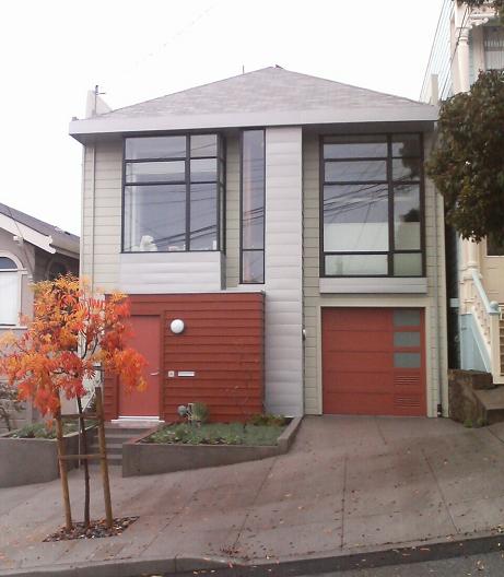
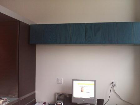
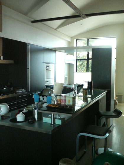
Ignore the bulthaup system 25 kitchen details for now and focus on the space above. Our old house had a double-height living space with a barrel vault ceiling over it, and we told Markoff-Fullerton Architects we liked it. So they and our structural engineer Mike Kaszpurenko of Structural Engineers Collaborative blew up most of the attic, removing all the rafters and beams, and under the roof created a rhythm of folded panels. You can see 2 ½ panels in that picture, the one closest to the window is lower to fit under the hipped roof. There's something about "space above" that is immensely satisfying, this house would be less with just 9-foot ceilings throughout. Initially I wasn't sure about Markoff-Fullerton's relatively complex handling of the ceiling, but without it the second floor would feel like a white barn (not that there's anything wrong with that); this design is substantially richer.

When you remove the roof beams, your house falls down, so that black steel beam in the picture is just part of the elaborate engineering to brace the house. (The silvery thing that seems to meet it is simply a fluorescent light hanging over the kitchen.) The office window has an up-down Hunter-Douglas Duette shade, in the picture its top is lowered to let light in while preserving privacy.

Here's a view the other way, from the office through to the kitchen, with the dining area and then the living room visible beyond.
looking through kitchen L
As you can see, this side of the house is a a straight uninterrupted shot from front to back: office-kitchen-dining area-living room, with no interior walls (requiring more structural engineering effort). The second-floor flooring is bamboo ply throughout. As always happens, the absence of walls makes spaces feel smaller than they really are.

The kitchen cabinets form a backwards 'L' shape around the kitchen island, and the part of the 'L' in the foreground forms a "pass-through" from the office to the kitchen. Its sides are two bulthaup appliance hutches with rolltop covers. Steve and Kai from bulthaup-SF at Limn did a great job working with M-F to design the kitchen, they spent two hours just finessing the problem of the corner where the casings meet in the 'L'. As the kitchen grew (the island is 10 feet long!) it shrank the office but it's the literal and figurative center of the house.

My post love handles has a close-up of the black stained oak of the kitchen and its immaculate handles. The gorgeous nordic blue kitchen counter material here and on the island is laminate. We read up extensively on the pros and cons of marble, granite, tile, sandstone, concrete, aggregate, terrazo, stainless, unobtainium, ... and laminate is definitely our favorite and most practical material. (That decision led to major "you can't be serious" attitude from superficial jerks at deluxe kitchen showrooms whose tiny minds can't disentangle wealth from marble counter tops.)

Unfortunately you can't see any of the folded ceiling panels in this picture. After the four variable-height folded ceiling panels over the office and kitchen you can see the ceiling drops down to a flat ceiling over the small dining area, punctuated by exposed bulbs and an access hatch to attic space above it. (All five segments are the same width—Markoff-Fullerton get details right) This is the lowest ceiling on the second floor and makes the dining area feel cozy despite being surrounded by space.

Here's a picture of that dining area. little dining area
It's a simple orderly space within the progression. The print on the wall is by Mark Stock, the tiny encaustic of the four spoons on the left is by Kelly Luscombe. Since this picture we switched back to a glass tabletop.

I've already shown pictures of the living room in stereo on and great media storage.

This is only one side of the second floor. The other side (bedroom-bathroom-stairs) is different and equally stimulating. It's hard to do the design justice in pictures, and they can't capture the changes as the sun moves and we adjust the shades and lighting.

Labels: , ,

Sunday, February 18, 2007

design: floor lamp

We needed a floor lamp to reach over a sofa.
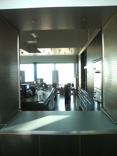
  • Artemide inflates their Tolomeo design (1989) to make a Mega version for a reasonable $500. But unlike their killer Tizio (1972, by Richard Sapper), I've always felt the Tolomeo poorly engineered and not especially attractive.
  • Similarly, Flos inflates the Archimoon by Philippe S+arck to make the Superarchimoon. Limn has it on display, it's better constructed than the Tolomeo but costs $7000.
  • Giant AnglepoiseAnd again Anglepoise inflates their eponymous Anglepoise, but it's not readily available in the USA.
  • Flos Arco lampFlos also makes the classic Arco lamp (1962, by Achille Castiglioni) with a shade on a curve for $2500 but that's real Carrara marble. Nice, but too 60s white shag rug conversation pit, and our living room has a low-ish ceiling. You can buy knockoffs of this for less.
As I bitched elsewhere, all of these use crappy wasteful incandescent bulbs. They're playing with scale but there's no re-engineering of the light source.

IKEA Samtid floor lampWe finally found Samtid at IKEA. $34.99 plus CFL bulb. Sold!

Labels: ,

eco: where are the brilliant LED lamp designs?

Went to Design Within Reach looking for some lamps. They have lots of OK "mid-century" designs for lamps, but almost every single one is packing a bloody incandescent bulb, one that wastes 95% of its electricity as heat. Have they not learned about compact fluorescents? Go to IKEA and every lamp has a CFL.

What's worse, is where are the LED lamps with brightness adjustability, color mixing, and amazing new forms that take advantage of the featherweight of LEDs? DWR only had two LED lamps, they should have dozens.

There's more technology in a $35 Black Diamond LED headlamp for the outdoors than in any lamp in the entire store. Pathetic! I guess "designers" only know how to mount a conventional bulb socket onto their creations. Actually mastering LED circuitry and electronic controls is too hard for them.

As I said before, Design without engineering is bad design, and there's a lot of it out there.

Labels: , ,

Monday, January 15, 2007

design: great media storage

When furniture designers create storage, they usually create a rigid geometrical grid, of, say 13 inch squares. Then they photograph it with pretentious piles of art books and a handful of CDs tastefully arranged in each square. But that's profoundly stupid. An LP record is 12 inches deep, but a CD is only 5 1/2 inches deep; a DVD is almost the same depth as a CD but taller. So the false logic of the storage grid wastes space.

I've had an inchoate idea for variable-depth media shelves for about 15 years. Architects Markoff-Fullerton brought the vision to reality, and Jesus Esparza of Cabinet Solutions built them. It worked out better than my fondest hopes.

media shelves
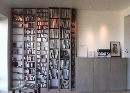
DVDs/videotapes, then CDs/cassettes, then LPs, then 45s. The uprights are closer together than ordinary bookshelves so there aren't wide expanses of LPs to tilt and warp. The three cabinets to the right hold two equipment racks and miscellaneous. The wall bracket holds my beloved incomparable Rega Planar 3 turntable.

Note how the shelves are perfectly evenly spaced from floor to ceiling. Bruce Fullerton is da man. He also met my space budget for each media, though I'm maxed out on singles.

media shelves
This shows the varying depth. It's good for sound quality since it breaks up reflections from the side walls. Note how the supporting shelves are recessed and darker so the uprights, in a lovely stained ash veneer, are more prominent.

I had the idea to take the same design and rotate it 90 degrees for shelves on the other side of the room:bookshelves
(This alcove is where the equipment cabinet was going to go before our acoustic consultant Richard Bird of Rives Audio recommended firing the speakers across the room instead of down the room. There are only a few shelves because there was going to be an elaborate stainless steel mantel continuing from the fireplace that would wrap into the alcove to create a metal container for firewood... too expensive.)

bookshelves
Jesus Esparza of Cabinet Solutions with his masterwork.

Categories: , ,

Labels: , ,

Wednesday, December 13, 2006

house: it's taps for me

Chicago Faucet wrist blade handles
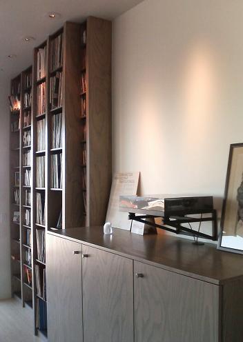
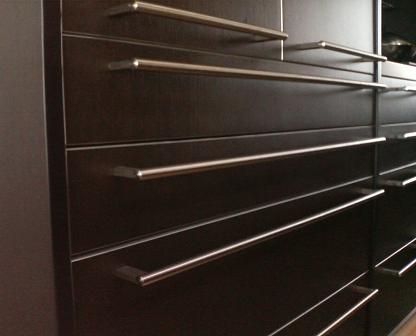
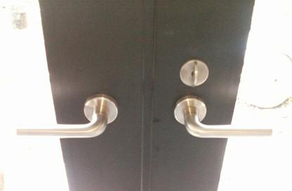
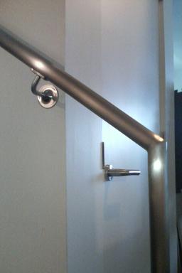
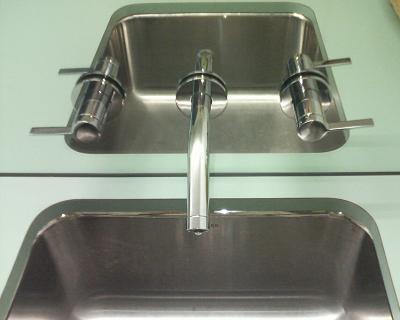
Perfection has been achieved in faucet handle ergonomics: the Chicago Faucet blade-style taps that you see in hospitals and bathrooms for the disabled improved accessibility. But they aren't especially modern.


Dornbracht Tara taps
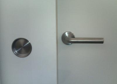
I knew of Dornbracht , their contemporary classic is the Tara line with cross-shaped handles. But the cross shape looks uncomfortable and is unreadable — you can't tell if the faucet is on or off. They look good even when the taps aren't aligned perfectly, but that benefits plumbers, not owners.


Then I found Dornbracht's Tara Classic, also from Sieger Design but with a single handle. It has some of the ergonomic benefits of a blade handle (you can turn them on and off with your wrists) and a beautiful design. The pulls in the house are satin stainless, but for plumbing we went with chrome because the matching accessories are only available in chrome. Dornbracht has a "platinum matt" finish for handles that is irresistably beautiful even though it doesn't match any other finish in the house. Here they are.
Dornbracht Tara Classic w/ platinum matt handles on Toto Supreme sink
(The sink or "lavatory" as builders call it is a Toto Supreme wall mount with SanaGloss, a glaze that really works to reduce build-up and make cleaning easy. We have a pair of them side-by-side.)

The bathtub has a nest of Tara Classic fittings. (It's a Toto six-foot bathtub, alas not available with SanaGloss.)
Dornbracht Tara Classic w/ platinum matt handles on Toto bathtub

In our downstairs guest bathroom Tara Classic wouldn't work as well because the taps are mounted in a mirror, also that floor has a less refined feel. We chose Kohler Stillness instead. The design is OK but lacks the clarity and tactile pleasure of the Tara Classic. You can tell the look of Stillness came first.Kohler Stillness taps in mirror

Grohe Atria fussy faucet design
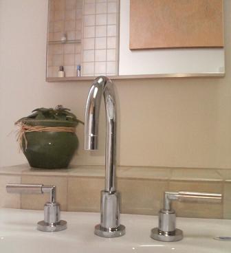
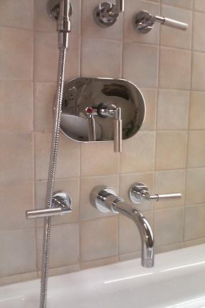
The Tara Classic is such an obvious design, yet nobody else has come close to it aesthetically. This Grohe Atria is similar but way too fussy, its handle pokes out the other side for no good reason. Delta makes a crazy tap unit with similar handles that looks like a V-twin engine. Dornbracht taps cost hundreds of dollars each, yet the Chinese aren't making cheap knockoffs of them, they're making copies of ugly boring designs.


Categories: ,

Labels: ,

house: front detailing

California Contract Co. handrail, Schlage L lock, Obline house numbers, Doorbell Fon, and mail slot
Handles meet up with accessories on the house front.

Note how the house numbers, door handle, doorbell, and generic mail slot are in a perfect line. Bruce Fullerton of Markoff-Fullerton really worked on the horizontal spacing, splaying the numbers across the door in a modestly strong way. I chose the house number font (Obline regular from customhousenumbers.com); unlike most modern fonts the '5' is upright and the '7' has a lovely subtle curve. The California Contract Co. hand rail, house numbers, and Schlage L mortise lock are all in satin stainless steel, but then the Door Fon and the mail slot are in brushed aluminum. If I had the money the finishes would all be identical; I'd also get the ugly gas connection and electrical meters hidden by any means necessary. Mies van der Rohe said "God is in the details", but God had time and money to burn.

, ,

Labels: , ,

house: love handles

With few interior walls and little decorative trim in a modern house, the pulls (what architects and builders call "handles") really stand out.

bulthaup handles
The bulthaup kitchen handles are a given. I don't like the logo they etch on the side, but it would have been crazy to replace them all. (For their new b3 line bulthaup changed the handles, making the supports chunkier.) Note the handles line up nearly perfectly. Dawson+Clinton installed the kitchen.

bulthaup handles
So we used the same handles on the facing 7-foot tall pantry doors from Cabinet Solutions.

Omnia cylinder finger pulls
Here are the pulls on the stained ash living room cabinets. This is my favorite piece of hardware: a cylindrical finger pull with a cylindrical cut-out for your finger. Pure perfection of Platonic form. Everyone makes them. The trick is finishing the edge so they aren't too sharp. I think we used Omnia hardware in brushed stainless steel.

Sugatsune flush pull in cabinet sliding door
For sliding doors in the cabinets, we used Sugatsune recessed pulls. They match the round theme, but somehow don't grab me as much.

office cupboards with touch latches
Sometimes the best handle is none at all. That's the office space where I'm typing this, another great set of stained ash cabinets from Cabinet Solutions with touch latches on the doors. On the left is the black oak "back" of the bulthaup kitchen, which also has touch latches on its drawers. (You can see the desk interferes with one of the drawers, but some day I'll figure out how to make it a height-adjustable sit-stand desk.)

Schlage L handles on Bonelli doors
Here are the door handles on the Bonelli french doors into the garden. The architects specified Schlage L series extra-heavy duty commercial mortise locks. We chose the 02 rounded corner handle in 630 Satin Stainless Steel. They feel great and don't have that extra hook on the handle that would make them look institutional, or the wacky expressiveness of Italian handles. They're expensive compared with Omnia but cheap compared with European locks like FSB.

Sugatsune flush pull and Schlage L lock
We used bigger Sugatsune recessed pulls on sliding doors. The finish almost but not quite matches the Schlage handles (you are in a maze of nickel satin silver, satin stainless, brushed stainless, ...). It would have been perfect if the Sugatsune depression was the exact same size as the collar on the handle; or maybe not, since you grab one and don't touch the other. Beauty, orderliness, utility, simplicity — there's perfection in there somewhere.

California Contract Co. handrail and Schlage L lock
A local fabricator, Michael Stang of California Contract Co., made the handrails for the stairs. They came out really nicely, as they should for thousands of dollars. It would have been so great if the bend radius of the support matched the door handles and the wall plate matched the lock collar!

See also sink handles.

Categories: ,

Labels: ,