cars: 1990s slant-nose beauties

I’ve seen a few Ferrari 458s on the road. It’s a strange, intense-looking car in person. In a debate on its beauty someone brought up the Ferrari F355.
Ferrari F355 Spider

For sure the F355 is a beautiful car. It’s such a smooth clean joy to behold. No grille, and no headlamps! (Nowadays, any car that’s not a sports car has a stupid non-functional shiny grille between the headlights, and every car has vast elongated headlights.) I love the F355 so much I bought three — Hot Wheels 1:64, Hot Wheels 1:18, and the Barbie radio control model that can only drive straight or reverse in a circle. (Whenever I meet Ferrari owners I ask if their F355 has the same steering problem, and if its mirrors fall off like mine.)

However, from that front angle, and only from that angle, the Lotus Elan (the ’90s M100 version) looks even nicer.
Lotus Elan (M100)
(dave_7’s Flickr photo)

The Elan was petite and thus light, and some say it’s the finest-handling front-wheel drive car ever made. But it was expensive, especially compared to the nostalgic retro Mazda Miata that launched at the same time.

Posted in cars, design | 1 Comment

How to”sign” documents so you can junk your Fax machine

Fax machines use a terrible scanner to send a grainy image of a page down a phone line, it’s last century’s technology that needs to die. And what is on that page? 99.7% of the time, it is something that was generated by a computer!

The main reason people think they need a fax machine is to sign documents, “please sign this form and fax it back to me.” But your signature on the document is just more grainy dots going over the phone line. Instead, add the pixels digitally: place a transparent image of your signature on top of an electronic document, and e-mail or upload that. Here’s one recipe.

First scan your signature.

  • On a white sheet of paper, sign your name in black ink
  • Scan it into your computer as a grayscale high-res (300 or 600 dpi) image. If you can, use your scanner options to
    • only scan the rectangle surrounding your signature
    • reduce grain (don’t scan the paper’s texture)
    • adjust the lightness/darkness (to pick up the signature and not smudges)

Make your signature into a transparent grayscale image

For the signed page to appear realistic and not like a glued-together ransom note, you need to blend the signature on top of whatever’s below (unless you can always squeeze your signature to fit in a white area). So you want to make the white pixels of your scanned signature transparent, but don’t want jarring transitions from black signature to image underneath. You could probably get the free open source ImageMagick command-line convert.exe tool to convert whiteness to transparency. Instead I used Photoshop Elements, at which I’m far from expert, to delete white areas; similar steps should work in free image editors like GIMP and maybe Krita.

  • Acquire the scanned image.
  • If you didn’t earlier, crop the scan to your signature, convert to grayscale (not sure how).
  • Zoom in until your signature fills the window.
  • Choose the magic selection tool, set feathered edge and anti-alias.
  • Click outside of signature, it should select all the surrounding whiteness.
  • Press [Delete] and the white should go transparent, showing the checkerboard pattern.
  • Click areas of white inside the signature (e.g. inside the loop of an ‘o’ or ‘e’), and press [Delete]. You can set Photoshop Elements so clicking adds to the selection and thus click several areas before  delete, or do it piece by piece.
  • You want to end up with an image that has the mostly-black of your signature and everything else transparent.
  • Save as a grayscale PNG file with transparency (alpha)  as Your_name_sgn.png
  • As a check, you ought to try overlaying the PNG file over a color gradient, to make sure it looks plausible — no white areas, no blocky dots, etc. — but I fumble around in image programs, so… ahhh screw it.

Placing your signature on files

Then, any time you need to “sign” a document, just place your signature image on top and save it as PDF. If you’re writing the document yourself, you can do something like Insert > Image > From file… , choose Your_name_sgn.png, move it, resize it, etc. (that’s in the free and open-source LibreOffice Writer program).

But most likely someone sent you a PDF or you downloaded it, and you need to put your image on the PDF. I found Photoshop Elements sucks at this. It’ll import a PDF, let you place your signature, and save as PDF, but it converts the whole page to pixels, so the signed PDF becomes a huge file whose text you can’t search or select.

Instead, put your signature on the PDF with the mighty free and open-source Inkscape drawing program.

  • File > Open the PDF.
    • if it has multiple pages, choose the one page you need to sign
    • Import text as text
    • don’t check Replace PDF fonts with installed fonts (?? I’m not sure about this)
  • File > Import…, choose Your_name_sgn.png.
  • Drag it into place, then grab a corner handle and holding down Ctrl (to constrain it so it doesn’t squeeze and stretch), resize it to fit. Because your signature is transparent, it can overlap text and lines.
  • View > Zoom > Zoom In to make sure your signature looks plausible — no white areas, no blocky dots, etc. If it doesn’t, you probably need to go back into an image editor to edit the  Your_name_sgn.png image.
  • File > Save As… , choose Portable Document Format (pdf), with options something like:
    • Don’t Convert texts to paths (you want the text to be selectable)
    • Use 300 dpi resolution for rasterization (? not too blocky)
    • Export area is page
  • With any luck, the resulting signed.pdf will be small, searchable, selectable, and look like you signed it.  Now you can e-mail or upload it.

Unsigned thoughts

Disclaimer: IANAL, I don’t know or care if this counts as a valid legal signature; it just looks like one.
Of course, if you can do this, anyone who has ever taken a credit card slip from you can do it too. A signature image on an electronically-transmitted document is worthless as proof of anything except “someone somewhere made an effort”. What we really need is electronic signatures. In essence, you transform the PDF file in a manner that only someone who has the private key for “S Page” could perform. It’s complicated but fantastically worthwhile. We’ve had the technology for years to create digital files and sign them to indicate “This must have come from person X” and/or  encrypt them so “This can only be read by person Y”; and combining them lets you do things like “This digital token is certified by Bank A to represent $217, and it came only from X and is intended only for Y.”

Cheers,
enjoy!
Posted in software | 2 Comments

movies: recent Woody Allen

Woody Allen’s recent Midnight in Paris is a fun trifle, stroking the audience’s ego with its 1920s Paris fantasy imagined by an intellectually lightweight author. Literally nothing’s at stake in this well-fed easygoing fantasy. It’s an echo of the far better, wonderful and sad Purple Rose of Cairo (also with a character named Gil!) released in 1985 (more proof that 1984 is the high point of Western civilization). It inspired me to rent all the Woody Allen movies I’ve missed. I’ve seen over 25 but his output is relentless, a movie every year for decades.

Even his recent misses are well-written, well-structured, well-paced. In some ways they don’t add up to anything, just urbanites talking, but perhaps because of his age Woody Allen is starkly laying out his philosophy which is that nothing adds up to anything anyway, so a pointless movie advances his argument.

You Will Meet a Tall Dark Stranger has great actors play a bunch of people deluded about love and the paranormal. (This after so many of his Mia Farrow-era movies are about strange and mystical goings-on.) The acting is fantastic, the observations droll, the unhappy marriage scenes are sensational. But then it just ends, leaving everything including a casually great plot twist/comeuppance (I had to pause the movie while laughing out loud in admiration) unresolved. The narrator helpfully explains that as Shakespeare (actually Macbeth) says, “life is a tale told by an idiot, full of sound and fury, signifying nothing.”

Whatever Works has a bunch of aging thinkers and young romantics and formerly religious find romantic fulfillment, then at the end Larry David as Allen’s mouthpiece turns to the camera and says

I happen to hate New Year’s celebrations. Everybody desperate to have fun. Trying to celebrate in some pathetic little way. Celebrate what? A step closer to the grave? That’s why I can’t say enough times, whatever love you can get and give, whatever happiness you can filch or provide, every temporary measure of grace, whatever works. And don’t kid yourself. Because its by no means up to your own human ingenuity. A bigger part of your existence is luck, than you’d like to admit

Posted in movies | 1 Comment

music: Little Feat’s Waiting for Columbus

Waiting for Columbus album coverI had this live double album and sold it because I wasn’t that big a fan. But I heard a friend’s copy and had to buy it again. “All That You Dream” has one of the greatest intros ever (video of another live version, not as crisp). Bill Payne’s synthesizer lines (ARP Oberheim, I assume) on “Time Loves a Hero”-“Day or Night”, though they sound dated, sear and soar. Another great pair of songs is “Tripe Face Boogie” and “Oh Atlanta” There’s tension between the down-home Southern boogie, New Orleans sophisticated funky vibe, jazz-rock jams (Lowell George left soon after over the usual “musical differences”) but out of that tension between the musicians came some phenomenal music.

Reading about the album and band on Wikipedia makes me appreciate it even more

  • it is considered by many rock music critics to be one of the best live albums of all time, even though significant portions of George’s vocals and slide work were over-dubbed later in the studio.
  • Little Feat were the backing band for Robert Palmer‘s album Pressure Drop, which featured his cover version of Lowell’s song “Trouble.”

Ahh, when live albums captured bands at their peak, with the mobile truck rolled up and months spent remixing and re-recording to perfect the presentation. Besides this, I have some other greats: Frampton Comes Alive, Welcome Back My Friends… (ELP), and Yessongs. Now most concert DVDs are a cheaply-made capture off the PA board, at best a slightly embarrassing memento.

Posted in music | Leave a comment

music: Led Zeppelin, conscious bloat versus generosity

This funny moment-by-moment review of a single Led Zeppelin song in concert nails the problem people have with them: “conscious bloat”.

But one man’s bloat is another’s inspired riffing. You could just as well label all dance music = mindless repetition, but if the groove is good, why not stay there? The genre I find most tiresome is jazz-rock noodling, exemplified by Traffic and other early 70s bands. If you enjoy real jazz improvisation, it’s hard to stomach. It’s expertly parodied by Derek Small’s Jazz Oddyssey that the band finally get to play in “This Is Spın̈al Tap.”[**]

That’s why I still enjoy and admire Yes. All five band members have compositional skills and insane musical chops, so they cram a ton of stuff in to every “song”, which to abuse and cheapen the language of classical music is really a collection of overture, movements, and interludes. If you don’t like the current musical phrase, it mutates or a brand new one comes along, literally every few bars. (Though even they’re not immune, I sat through a turgid Chris Squire bass solo in which he wanked away on “Amazing Grace” to little point.)

The punks had the answer to the problem of bloat: shorter songs! I’m sure there’s a cultural explanation of 1970s lonnnnnnggg songs, a combination of drugs, laziness, the contrast between pop ephemera on AM radio and real extended rock on FM, and the compulsion to do something different to escape the vast overhanging shadow of the Beatles.

The 2010 New Yorker profile of Elvis Costello digs up his classic put-down: “I am really grossly offended by Led Zeppelin,” he said in 1986. “Not only because they’re total charlatans and thieves, but because it actually embarrasses me.” OK but that doesn’t stop II and IV and parts of everything else being fantastic. (After reading that I pulled my albums off the shelf and listened through them all just to verify.) If Elvis can’t hear the majestic punch of the music, well it just explains why the production of his own songs is so hit-and-miss, and often sub-par.

[**] To full appreciate “This Is Spın̈al Tap” you have to sit through Zep’s “The Song Remains the Same”, “Yessongs”, the ELP tour video, and more. It should come as a boxed set with its genetic source material.

Posted in music | Leave a comment

design: the classic Braun watch and similar

The Guardian had a special offer on a handsome Mondaine watch, which reminded me of the watch I wear, which led me to a design article about it and some weird new Braun watches.

The AW was designed by Dietrich Lubs in the almighty Dieter RamsBraun design studio, I think in 1989. It’s a beautifully restrained simple design: the watch face is quite small, and the brushed finish is fantastic. It’s not completely minimalist, the touches of Bauhaus red and yellow bring it to life. My AW20 CS model from 1990 shown above is the consummate form, but Braun came up with dozens of variations: black face, chrome/black rim, dateless, Bauhaus blue/red straps, no hour numbers, platinum finish, etc. The last is the AW50 P, lovely but different in its details.

The watches were available from lots of museum stores and design catalogs in the USA, but availability dwindled and sadly I’ve not seen one for sale in stores for years. They are reasonably priced; I think Braun gave some away with their top of the line shaver. I ordered mine from timedesign.de . The watch is durable, but in case it is discontinued I ordered a spare, plus an AW50 P that I’ve never removed from its box. I also ordered a bunch of spare straps because the smooth band of leather eventually disintegrates at the clasp. My first order never arrived— some postal employee in the delivery chain has a couple of nice wristwatches ☹—but to their credit TimeDesign resent the order.

There are similar designs. Ruedi Külling designed the clean Xemex Offroad classic design for a lot more money in 1996, but Xemex seems to have moved on to chunky chronometer crap.

And Mondaine the “Official Swiss Railways Watch” (as opposed to Victorinox the “official Swiss Army watch”) took Hans Hilfiker’s 1944 Swiss railway station clock and put it on a strap in 1986, e.g. their A669.30008.16SBO model. The Braun is the Futura of watches, the Mondaine is the Helvetica.

Posted in design | 5 Comments

design: irrational fear of handles

Our kitchen is full of drawers, thus a handsome grid of handles.  Even as we installed it, the trend in modern kitchen design moved on to eliminate the handles altogether, as if you open drawers in your alien autopsy lab using psi powers.

The P′7340 range from Poggenpohl Luxusküchen and Porsche Design is an example of this extreme, and you can see how non-functional it is. Before you open a drawer, you have to open another drawer that has the huge front panel.  And if you want to use that bottom drawer, there’s a tall panel blocking access.
Posted in design | Leave a comment

software: how Live CDs can close the deal

I tried out the some new operating systems by booting them off a USB flash drive, including Fedora 15. Fedora 15 seemed to work fine on my hardware and looked promising, but it wasn’t dramatically better in a few fumbling hours of use and I couldn’t tell from the live USB environment if it would consume less resources with my default apps, so in the end I didn’t install it (and didn’t follow up filing bugs for the issues I found). Instead I stuck with Kubuntu (the KDE “Plasma” desktop UI on Ubuntu). I took the upgrade to 11.04, for KDE this was a minor no-surprises upgrade., Instead I stuck with Kubuntu (the KDE “Plasma” desktop UI on Ubuntu). I took the upgrade to 11.04, for KDE this was a minor no-surprises upgrade.

Live CDs/Live USBs have an undeniable “gee whiz” factor: I reboot my computer and without installing anything or changing my system it’s running a different operating system! But if the Linux distributions providing these Live CDs/Live USBs want to close the deal and actually convince users to install them, they need to reassure users that everything will work and sell them on it being dramatically better. That means they need to do things like:

  • Scan your hard drive partitions, detect which ones are Windows/other UNIX-like, mount them so you can see them from the Live environment, and create symlinks to “Your old documents”, “Your old downloads”, etc. in the live environment.
  • Have some sample audio and images so their music player, photo gallery, and sound and image editing programs have something to work on (and incorporate the existing media from your current hard drive).
  • Provide copies of and links to the “Welcome New User” guidebook and release notes for new release.
  • Configure and demonstrate their next-generation OS features. The system-wide desktop search or semantic knowledge acquisition or time-based journal whatever needs to put up a dialog saying “Reading the sample documents (and existing media from your hard drive), … now open Nepomuk/Strigi / Tracker / Zeitgeist.
  • Determine the applications you’re currently using by inspecting your current “Start” menu and desktop shortcuts and by scanning your current hard drive, and , and suggest which ones are already available in the Live environment, which have alternatives you can install in the distribution, which applications handle the same file formats, etc.
Posted in computers, software | Leave a comment

art: Deborah Butterfield K.O.s AbEx at ART MRKT

It was interesting to go to ART MRKT and see the work that high-end galleries and organizations pay to present. I couldn’t discern any theme to it all. One gallery was hawking Damien Hirst prints, such as a 2-D diamond-dusted print of his £50 million diamond-encrusted skull For the Love of God; the faint echo of a self-referential over-the-top critique of life and art is so powerless it insults the purchaser. Others were showing lesser works by California artists Diebenkorn, Jess, etc.

I couldn’t tell if canvases daubed with splotches were from 1950 or 2010. That feels strange for the quintessentially “modern” form of Abstract Expressionism.

Deborah Butterfield’s recumbent horse was astounding. Unlike her iconic upright horses that just amaze you with the horseness, the gentle whorl of bronze branches pulls you in before confirming it’s a horse. It’s one of the best small sculptures I’ve ever seen.

Kamoe, 2009 bronze 17” x 58” x 36”

Kamoe, 2009 bronze 17” x 58” x 36”

Kamoe, 2009 bronze 17” x 58” x 36” Gallery Paule Anglim

UNDER CONSTRUCTION Other good stuff: Staprans colored still life like Degas but with colored edges, comically bad Kneeling Archer Bart in Chinese style, Chris Dorosz drips on acrylic rods forming tech sculptures, Patrick Hughes inverted perspective of painted rooms folded backward, Nemo Gould’s boxed dioramas.

Posted in art | Leave a comment

books: sex and science-fiction

Three S.F. books, all going way beyond impersonal characterless scientists in lab coats.

Sprawling, very good!

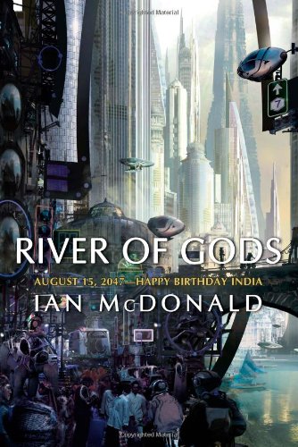
cover of 'River of Gods'

★★★★☆ This does a fantastic job of presenting the foreign culture of Indian nation-states on the brink of cataclysmic changes, while marrying it to big science fiction ideas. It’s got the Gibson approach of jumping between various characters that slowly converge, but with 12 or so plot-lines going instead of three or four. A few of the plot lines are packed with explicit sex, others with violence, one with trans-post-sexual body surgery, another with the weary detective. It’s so genre-inclusive as to be tiring. It covers the discovery of limitless energy but that’s a sideshow to the tale of a bizarre alien artifact predicting a new form of humanity that combines Arthur Clarke Rendezvous with Rama and Gibson’s idea of A.I.s taking the future into their own hands. It’s all good stuff, nearly great. Its main flaw is that considered together, the many cinematic action sequences are implausible: gigantic mechanized bots can appear out of nowhere and destroy cars, but when it suits the plot a plucky heroine gets to repeatedly escape bad guys in the nick of time on a hydrogen-powered putt-putt scooter. Make up your mind!


Hippie freakout

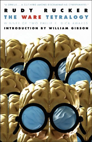
cover of 'The Ware Tetralogy'

★★★☆☆I finally got around to reading the series, the price is right in combining his four novels Software (1982), Wetware (1988), Freeware (1997), and Realware (2000). It’s downright freaky. Way too many aging hippies with greasy hair having sex, then he introduces the ridiculously implausible idea of “merge”, wherein two people become undifferentiated goo during the sex act, yet given a few minutes can separate and reform. For a time in book two it trots along well with one lone robot survivor on earth. And there’s a nice appeal how the characters from interlocking family trees recur over decades. But the first book’s innovation of a stored program of human (portrayed without any of the sly class of Dixie Flatline the ROM construct in Gibson’s Neuromancer) make death inconsequential, and the technological progress beyond that in the series leads to inventions so wondrous (a “moldie” biological robot can morph to form a shell around a person and fly them to and from the moon) that there’s almost no dramatic tension. Any one of the books ought to be a technological singularity, yet humanity continues on through them with the drugs and bad hair, and outside the big ideas the dull unchanging normality of humanity (drugs, motels, flip-flops, cars) is strangely unimaginative. Rucker’s just reciting one way a future pans out and the only advances that happen are the ones he focuses on.


Sweet but unambitious

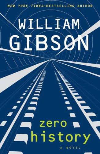
Cover of 'Zero History'

★★★☆☆ The former master of hard-edged intricate plotting and mind-bendingly clever future projection continues to idle with another present-day travel novel with mildly interesting observations on current trends (no-label fashion, base jumping, biomorphic remote control zeppelins, whatever). The whole book climaxes in a park intercept that’s the rough equivalent of the Maas Biolabs extraction in the almighty Count Zero; but that book gets the build-up and operation done in just 50 pages and follows with buckets more action and ideas. It’s faintly embarrassing that Gibson parlays his moderately high lifestyle (a private London hotel, fashion week in Paris) into pages and pages of detailed description of the same. Bring back nihilist misfits and underdogs chafing against this self-satisfied society! Several characters from Spook Country (2007) reappear, including the usual plucky solo heroine making sense of things. Finally someone gets to have sex, and Gibson is oddly decorous and romantic in his flat narrative voice. It’s sweet and well-written, but it attempts so little.


These hReviews brought to you by the hReview Creator.

Posted in books | Leave a comment